
These days everybody has an app, and it’s getting harder and harder to be noticed. The average consumer isn’t downloading many apps, and they are constantly distracted while on their smartphones listening to music, checking notifications, and a litany of other tasks. In January of 2013 Apple reported that the total number of apps available in the App Store clocked in around 775,000. That’s a boatload of apps and like it or not, getting iOS users to download your game, to-do list or what have you app over the next guy’s is no small feat.
Now, once users make it to your App Store product page you can put your marketing savvy to work by optimizing copy, keywords and reviews. But to get to this semi-customizable page, users must first make the leap from search menu to product page. And that’s where things get tricky.

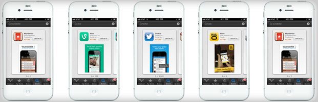
From the search menu (see first screenshot above), there are three on-page info bytes that factor into whether or not searchers click through: price, average reviews and screenshot. Price is ultimately a business decision, and reviews are a marketing challenge of their own. That brings us to the screenshot. With nothing but name, company and category in terms of copy, there’s not much opportunity to sell your product with descriptions or clever wording — unless you get creative. As entrepreneur and product guy Jason Shah points out in this excellent piece on Vine’s UX, while copy options are extremely limited, “nowhere does Apple require the screenshot to *only* be a screenshot.” Here are a few great examples of mobile developers leveraging the screenshot space to convince searchers to click through and learn more on the app page.
Hailo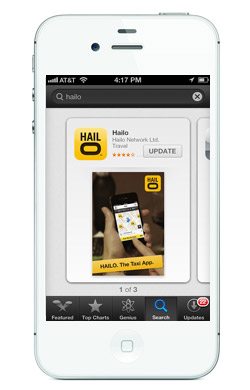
If cabs are hard to come by where you are, Hailo is a great app to have on hand — but if a user doesn’t know the app by name, there’s no way to glean that from the search results page. To get around these limitations, Hailo provides a panned out screenshot, which includes the phone itself and an explanatory banner that reads, “Hailo: The Taxi App.”
Vine
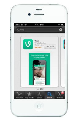
Vine has had its share of time in the spotlight this year, but an iOS user that has heard the name tossed around won’t necessarily know what the app actually does. To get around this learning curve, Vine shrinks the screenshot and includes a concise six word description: “Send and share beautiful looping videos.” That’s Vine in a nutshell.
Wunderlist
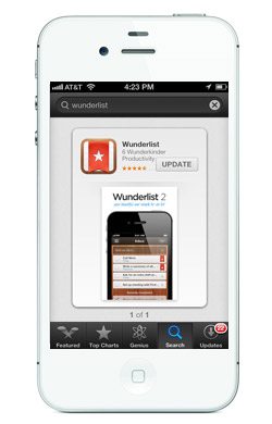
Between the name of the app and the screenshot, users can probably glean that Wunderlist is a list app. But just in case some are left wondering, Wunderlist provides a quick one-liner to explain: “Wunderlist: your beautiful and simple to-do list.”
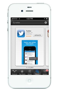 That’s right, there are still people out there who don’t know what Twitter is. And some of them are iOS users. Twitter concedes to coddling by providing a few clues within the search results page screenshot. First off, there’s the clever headline, “Twitter: your global town square.” But since that line is bound to leave most Twitter newbies scratching their heads, a second caption provides a bit more in terms of why and how: “Build your timeline by following people and things that interest you.”
Looking to get the word out about your mobile app? Facebook’s Mobile Install Ads appear within the News Feed for users on mobile devices and include custom image and text, as well as the Install Now call to action.