Mobile and web apps are often placed in the “low-commitment” product category – that is, they are either low-cost or free and require a minimal amount of personal information from the visitor. But that’s no excuse to neglect the landing page. This one page is your opportunity to convince users to download, signup, buy – what have you. And since that opportunity is lost once users navigate away, it’s important to be considerate of three things that this web-savvy audience highly values: time, commitment flexibility and privacy. These tactics will help you build landing pages that inspire those visitors to convert.
Be concise
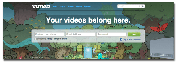
Vimeo does a great job of getting a powerful message across in as few characters as possible. If this were some obscure online video service that most people have never heard of, the landing page would require a bit of user education. But since many web users have likely encountered the service at one point or another, Vimeo forgoes information overload for a four-word, feel-good statement that encourages visitors to sign up: Your videos belong here.
Use multimedia whenever possible
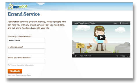
Visuals are a great way to share the value of your product or service without delving into wordy details. Videos, infographics and vivid product imagery are quick ways to get your message across while keeping shortened attention spans in mind. TaskRabbit is likely a foreign concept to many, but the message is easily communicated in illustrated video format.
Be wary of commitment-phobes
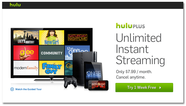
The oft-used “Sign Up” button typically implies some sort of casual contract, so it’s good practice to focus on benefits rather than commitment. Hulu pulls this off in the example below by inviting users to “Try 1 Week Free.” For true commitment-phobes, the “cancel anytime” bullet directly above lets users know that the free trial is in fact just a trial.
Cater to mobile devices
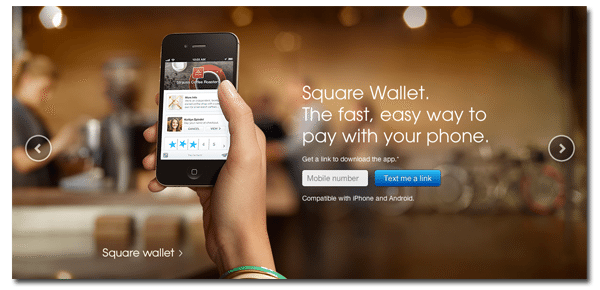
We’ve covered the immense value of mobile landing pages, but there’s also a chance that visitors are researching your mobile app on a desktop device. By requesting visitor phone numbers, you can automatically text them a link to transfer the process to the intended device. This prevents conversions from becoming an afterthought stuck somewhere between desktop and smartphone.
Make the sign up process as convenient as possible
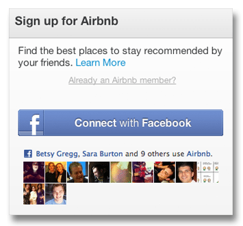
Give visitors the fastest route possible to maximize sign ups. Many application and startup sites are opting for social logins to streamline that process for users. For more information on that, check out Robert Scoble’s thorough list of social login benefits on Quora. While data shows that Facebook is the most popular social login option among users, Twitter, Google Plus and other social platforms are also viable options – it all depends on where your potential users hang out online.
For more tips on building landing pages that meet customer needs, download our free landing page needs assessment tool.