Whether it’s on purpose or a happy accident, when consumers land on your page, you’ve got a limited amount of time to reel them in. A well-structured landing page is key in getting users to take that next step – whether it’s signing up for your email list, “liking” your Facebook page or clicking to your website. Each week, lonelybrand highlights a killer landing page design that gets the job done.
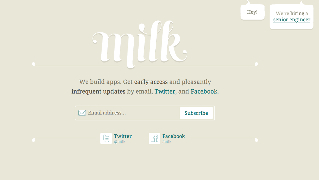
This week’s featured landing page originates from Milk Inc. Why did it make our list of Best Landing Page Designs? It’s a take on the traditional “coming soon” page that clearly and concisely tells us everything we need to know wrapped up in one aesthetically pleasing package.
- What do you do? We build apps.
- Will you bug me incessantly if I give you my email? Get pleasantly infrequent updates.
- Are you hiring? We’re looking for a senior engineer.
- Where can I find you on the social web? Twitter and Facebook, of course.
Want landing page optimization tips? Look no further than our ‘Landing Pages 101’ white paper.
