
It feels like we’ve followed Visually from the beginning. We first wrote about them as a tool for marketers to present data in an attractive way. Then, we covered their marketplace, which allowed brands to get a great infographic built out-of-house for an affordable price. Now, with a site refresh under their belts, we’re covering their landing page design. Here’s what makes it work.
Prioritized
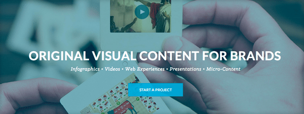
Now that the site is focused on selling services and connecting brands and designers, this information is given top billing and the greatest emphasis. That’s then followed up by clients, capabilities and testimonials…all before you’re actually served the community’s work.
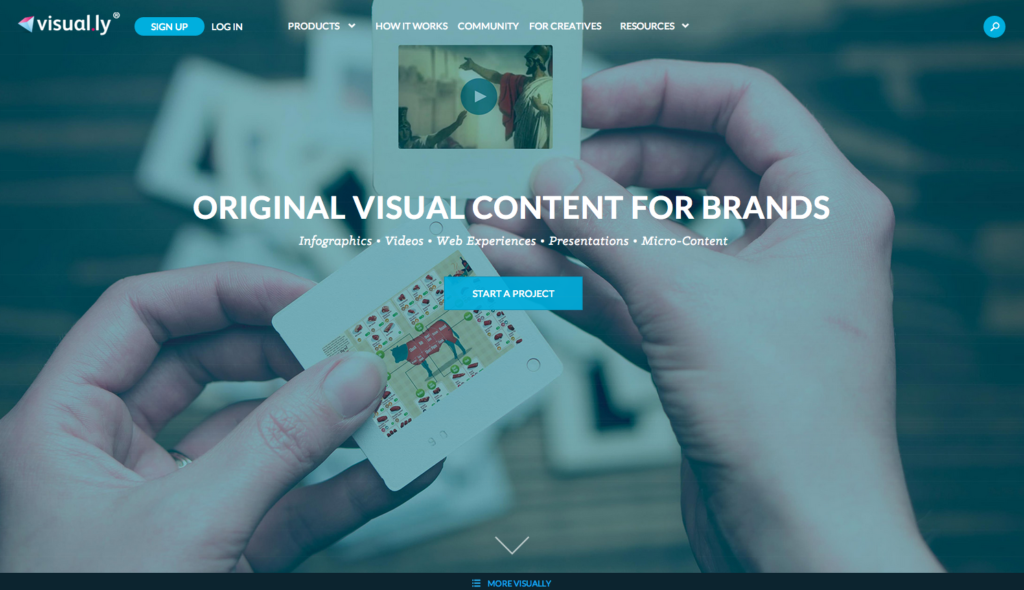
Scrolling + navigation bar
Site visitors are given two ways to navigate and explore – scrolling through the ‘about’ information all contained on the landing page, or clicking on a desired section in the navigation bar. It’s the best of both worlds and seeks to quickly provide what a visitor might be looking for.
Ever present CTAs and points of conversion
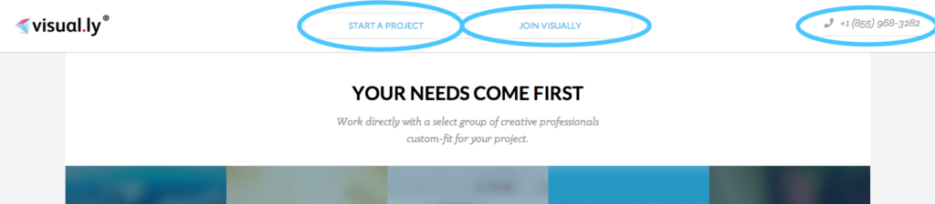
Even as a user begins scrolling through the ‘about’ information, they’re still followed by CTAs inviting them to start a project, join the site or give them a call.
Looking for more examples of great landing page design? Check them out here, or get schooled in Landing Pages 101 here.