Have a lot of information that you want to get across to readers quickly? Infographics are a great way to do it, but since they’ve become part of the package for nearly every Mashable or TechCrunch article, just a simple pie chart will no longer do. Enter Visual.ly.
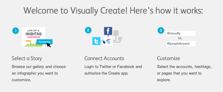
By linking social accounts to their registered Visual.ly account, users can create customized infographics analyzing social stats, hashtag performance and (coming soon) Facebook insights in real time. Although the templates to choose from are somewhat limited now, the process of creating them is incredibly simple and straightforward.
Yup, that’s all there is to it. Visual.ly does all the hard work for you, including finding the genesis of a hashtag and finding the top influencer that used it. Oh, and did we mention it’s free?!
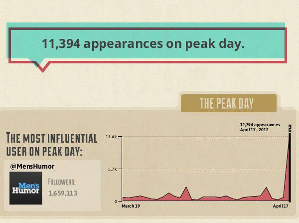
Once designed you can download the graph, share it via your social networks, or embed it into another post. For illustration purposes, I decided to analyze the hashtag #Lunchtime that was promoted yesterday by McDonald’s (won’t they ever learn?). Unsurprisingly, yesterday was the high point of the hashtag’s lifespan. Unfortunately for McDonald’s, the most influential participant was Men’s Humor. Probably not what they were hoping to achieve…
To get an idea of the final product, check out my full infographic by clicking on it below.
What are some other sites that you couldn’t live, or work, without? Let us know what they are in the comments below!


