 As a twenty-something professional that spends an unhealthy amount of time on the Internet, I see a fair share of ads relating to grad school. Between Facebook ads for post-secondary programs at my alma mater to native ads for some school of digital marketing wizardry in Europe, there’s an eb and flow of solicitation that, as a digital marketer, I can’t help but judge. The other day as I listened to Songza tunes at work I noticed this particularly well-executed paid media campaign form UNC’s business school.
Here’s a look at what makes UNC’s landing page experience work.
Illusion of multiple pages
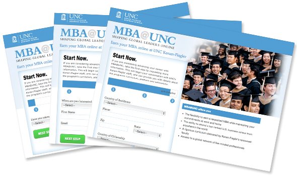
Instead of tossing out a lengthy form, the landing page uses javascript to turn multiple pages worth of information into a unified, one-page experience. Visitors are able to run through multiple steps without the interruptive experience of navigating away from the original landing page.
Progress tracking
As users slide through the sections of the form, they’re given a clear idea of their progress thanks to a completion bar at the top. This awareness helps prevent form fatigue — that feeling you get when forms feel endless and you’d rather just give up.

Opportunities for research after form completion
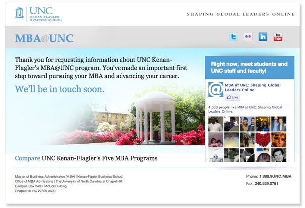
Once users complete the form, they land on a new page that offers a bit more information. It’s important to gather necessary information before throwing out distractions all over the place. To the right, UNC invites visitors to “meet students and UNC staff and faculty” using image-backed social proof. Below, visitors can click to see a nice visual program comparison chart.
 For more tips on increasing landing page conversions, check out our free landing page design tool.