These days the lonelybrand calendar is an ever-expanding a rainbow of afterwork Chicago tech community events. One shining star among the many is App Challenge Chicago, a hackathon that takes ideas from pitch to launch all in one day. Designers and developers can register through the morning of September 29. Fellow business and marketing people, you can join me on the waitlist.
An exciting event indeed – but we’re here to talk about how App Challenge Chicago found its way onto to our list of best landing page designs.

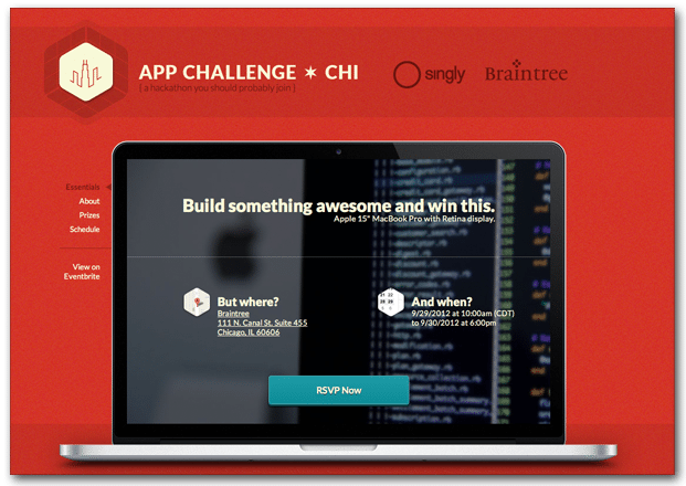
Eyes on the prize. The top prize – a Retina Display MacBook Pro – is front and center, serving as a frame for the rest of the event info.
One button = one call to action. The logical next step for visitors is to sign up for the event, and that option manifests itself in a large and clear RSVP Now button.
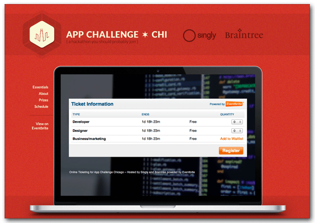
Register on-site. When you hit the RSVP button, Eventbrite ticketing information pops up on the same page rather than booting you to an external site – a nice touch for those who want explore a bit more before committing.

Are you a startup with a killer landing page? We want to feature you on our list of Best Landing Page Designs! Shoot me an email at katherine.l(at)lonelybrand.com. And for landing page optimization tips, look no further than our ‘Landing Pages 101′ white paper.