
Apple’s announcement of a Retina-enabled Macbook at the Worldwide Developer’s Conference raised the bar for portable computing power. Apple has also issued a big challenge to hardware manufacturers: up your screen resolution game or lose out. Brands like Toshiba, Samsung, Dell and countless others are undoubtedly preparing their response with higher quality laptop, desktop, tablet and smartphone screens that pack more pixels into thinner frames.
If the challenge to brands who spend big dollars making sure their websites look great isn’t already clear I’ll summarize: Your website looks like 1993 again.
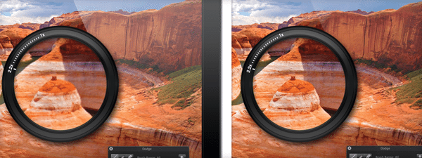
Don’t get me wrong, the new Macbooks don’t make top websites look bad. Those websites just aren’t designed to be Retina-friendly. There’s a big opportunity for brands to differentiate by quadrupling the resolution of design elements so they look crisp and beautiful when viewed on a display with high pixel density.
It’s also clear that the web as a whole is going to struggle through this display adjustment. Designers and developers the world over will have to transition to sharper graphics, or suffer the consequences. With the introduction of the new iPad, apps and websites that failed to optimize for retina suffered through criticism of shoddy graphics. The same cycle will stand for current iterations of buttons, logos and images on the new Macbook Retina; without optimization, graphics are doomed to appear blurry and pixelated on these shiny new screens.
My advice? Get your team of designers and developers together and actively prepare your brand’s website for the first of many high resolution, high pixel density display devices.