If you attended Techweek 2012, chances are you’ve heard a thing or two about TaskRabbit. The online and mobile marketplace lets users outsource errands to people nearby so that those pesky chores – the drycleaning dropoff, the IKEA runs, the birthday cake baking – can finally get done.
Let’s talk about why TaskRabbit made our list of best landing page designs.

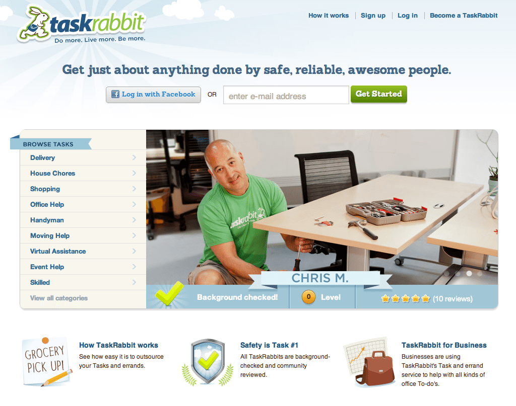
Two quick signup options. Visitors can get started immediately with social login or by entering their email address. More information is required to complete or post tasks, but this step gets visitors into the system for follow-up.
Visual hero. The eye is drawn to a rotating collection of images that shows TaskRabbits in action. This is a great way to show visually-inclined visitors what the service is all about. If they’d rather read, a simple menu to the left of the image lets them browse tasks.
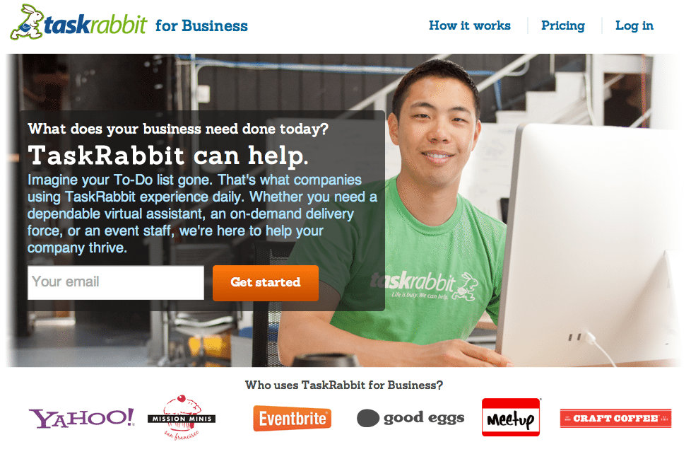
Segment users. In the bottom right corner you’ll see a link for businesses interested in using TaskRabbit. Clicking the icon actually leads to a separate landing page – a smart segmentation move since businesses have an entirely different set of needs and questions.

Are you a startup with a killer landing page? We want to feature you on our list of Best Landing Page Designs. Shoot me an email at katherine.l(at)lonelybrand.com. And for landing page optimization tips, check out our ‘Landing Pages 101′ white paper.