![]()
When it comes to software as a service, it’s generally best to show users the benefits of your tool rather than tell them. This is typically executed through the freemium model, which will hopefully wet the user’s palate for more. But as many software entrepreneurs have noticed, giving stuff away for free can be easier said than done.
So how can SaaS companies establish enough initial interest to get visitors to make that freemium conversion? Check out this creative approach from Toggl, as they cleverly integrate their time tracking software into the homepage to automatically turn visitors into actual users.
Immediate interaction with the tool
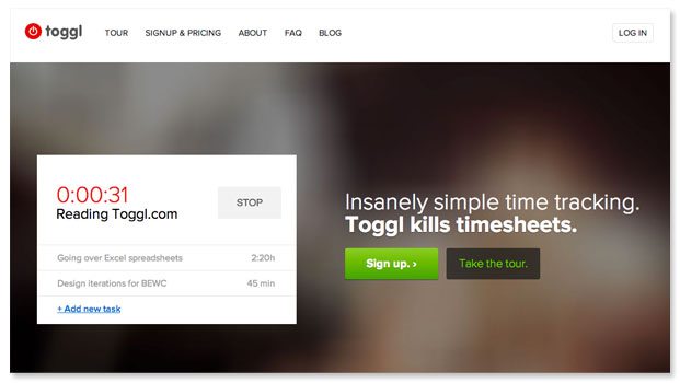
Visitors have the chance to see how the tool works as soon as they hit Toggl’s homepage thanks to a time counter that actually tracks how long you spend reading Toggl.com. This is a cool way to get visitors to interact with the tool instantaneously.

Subtle social proof
Just below the fold you’ll see a series of logos indicating big name brands that use the tool. Since the point is to reference these customers but not create a distraction, the logos are greyed out and do not link to brand homepages.
30 seconds to freemium
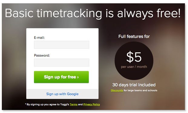
The sign up button leads to an actual sign up, not an opportunity to be contacted by the sales team. The form requires just two fields: email and password, and from there users are taken straight to the 30-day trial.

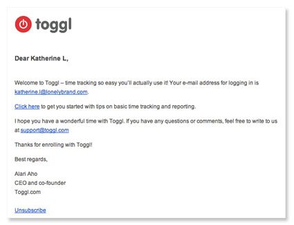
Signing up also triggers a confirmation email that links to basic tips for using the tool and a contact for user support, showing freemium users that there are helpful humans behind the tool.

For more tips on increasing landing page conversions, check out our free landing page design tool.
