Whether it’s on purpose or a happy accident, when a consumer lands on your page, you’ve got a limited amount of time to reel them in. A well-structured landing page is key in getting users to take that next step – whether that means signing up for your email list, “liking” your Facebook page or proceeding to your main website. Each week, lonelybrand highlights a killer landing page design that gets the job done.
Threadless is an artist community that allows users to submit t-shirt designs online. The designs are then put up for a public vote, and a small number of winning designs are printed and sold online and in retail stores. That’s a cool business model and one that is agreeable to our perpetually wired personalities. But the fun doesn’t end there…
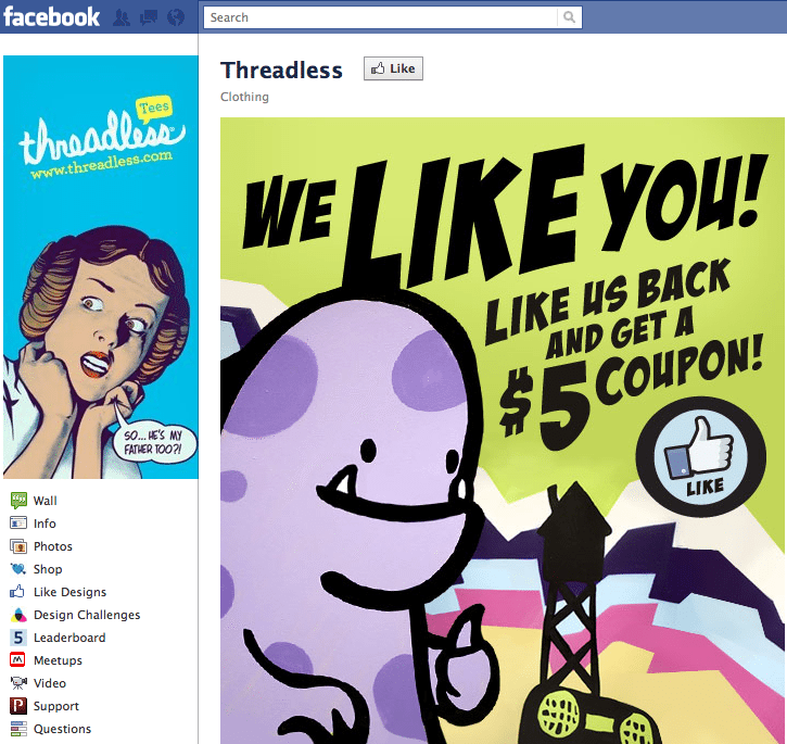
So why does Threadless’ Facebook landing page rule? Here are some reasons why it made our list of Best Landing Page Designs:
- We like the splash graphic that mirrors the brand and screams, “THUMBS UP!”
- Old fashioned friendliness: “We like you.” Thanks, Threadless – we like you too.
- Immediate, tangible incentive: “Like us back and get a $5 coupon!”
Want landing page optimization tips? Look no further than our ‘Landing Pages 101’ white paper.
