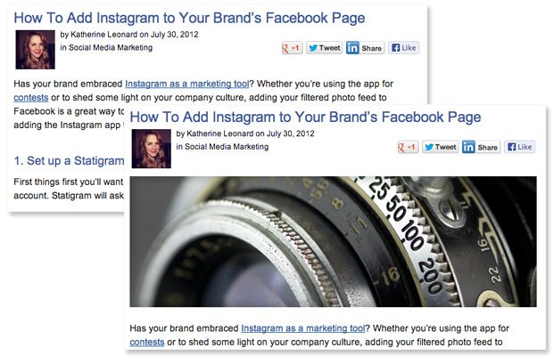
Given the overwhelming success we’ve seen with images on other platforms from Facebook to Pinterest and Instagram, we decided to run a little experiment with images on our blog. In March 2013 we began prefacing each new blog post with a large, vivid image. We also went back and added these banner images into some of our most trafficked posts from the previous months.
Below, you can see the before (no banner image) and after (banner image included). Once the additions were made we started tracking time on site for these posts to test whether the image influenced visitor behavior. Our hypothesis was that the images would grab visitors’ attention to pull them into the article itself, thus increasing time on site. 
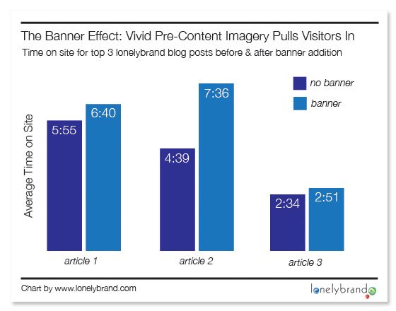
As you can see in the chart below, visitors stuck around significantly longer once we added the banners. This was true not just for one, but for each of our top three posts.

This seems to be yet another win for the visual web. As with other platforms, incorporating enticing visuals into blog posts gives us the ability to grab vistors’ attention and pull them into the content. Without banner images, readers were dumped into 500+ words of text, which is not necessarily the most engaging way to kick things off.
Looking for high-quality images to use in your blog posts? Check out this list of resources for digital marketing imagery.
