In November of 2012 the Coca-Cola Company switched gears on their brand website, focusing on content and storytelling rather than pure play product and advertising.
Immediately prior to the site flip, Ashley Brown, Coca-Cola’s Director of Digital Communication, sat down with the New York Times to explain this move. He described the new concept as a newspaper or magazine, so inherently content heavy that his team was actually restructured to become more like the editorial team at a magazine. For more info on the strategy that went into building the site, the NYT piece is definitely worth the read. Here, let’s take a look at how the site looks, feels and reads nine months in, and exactly how the Coke team articulates the concept of replacing a branded website with an online magazine.
The site itself is branded as Coca-Cola Journey, which the aforementioned NYT article notes was inspired by the name of an internal employee magazine from the ’80s and ’90s.
Content Mix
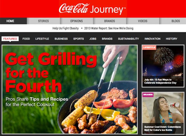
The site breaks content into nine separate categories: food, lifestyle, business, sports, jobs, brands, sustainability, innovation and history. Some but not all of the content is directly related to Coca-Cola products; articles range from more traditional branded posts (Icona Pop: Song in Diet Coke Ad Tops Charts) to more journalistic pieces that only loosely, if at all, intersect with products (Shinrin-yoku: The Japanese Art of Forest Bathing).
As far as format and style go, the content spans from interviews and opinion pieces to video, audio clips and photo galleries. Standard web content is available from the lower menu, including sections such as the press center, job openings, contact forms and investor information.
Infographic Branding
Content definitely takes the spotlight on this site, and it’s not always brand focused. To bring it back to the brand, there’s an illustrated band of brand info below the content elements but above the traditional web content. With fast facts and visual data, it looks and feels like an infographic.
Quantified Engagement
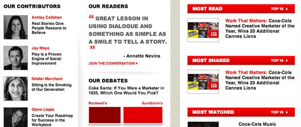
Under that infographic branding, Coke throws in some proof of engagement. There’s a spotlight on the writers, quotes pulled from reader comments and polls. A “most” section covers most read, most shared, most watched and most debated content. Finally, at the bottom, a social media hub pulls in counts from each of the company’s social platforms. How’s 68,674,012 Facebook likes for social proof?


