Today’s best landing page design feature is near and dear to my heart because of some street teaming action I did for them in their early days.
Zaarly is a community-based solution for finding what you want, when you want it. It’s a pretty simple concept: download the app, post what you want, when you would like it and how much you are willing to pay. Then wait for bids from other local Zaarly-lovers looking to make a quick buck.
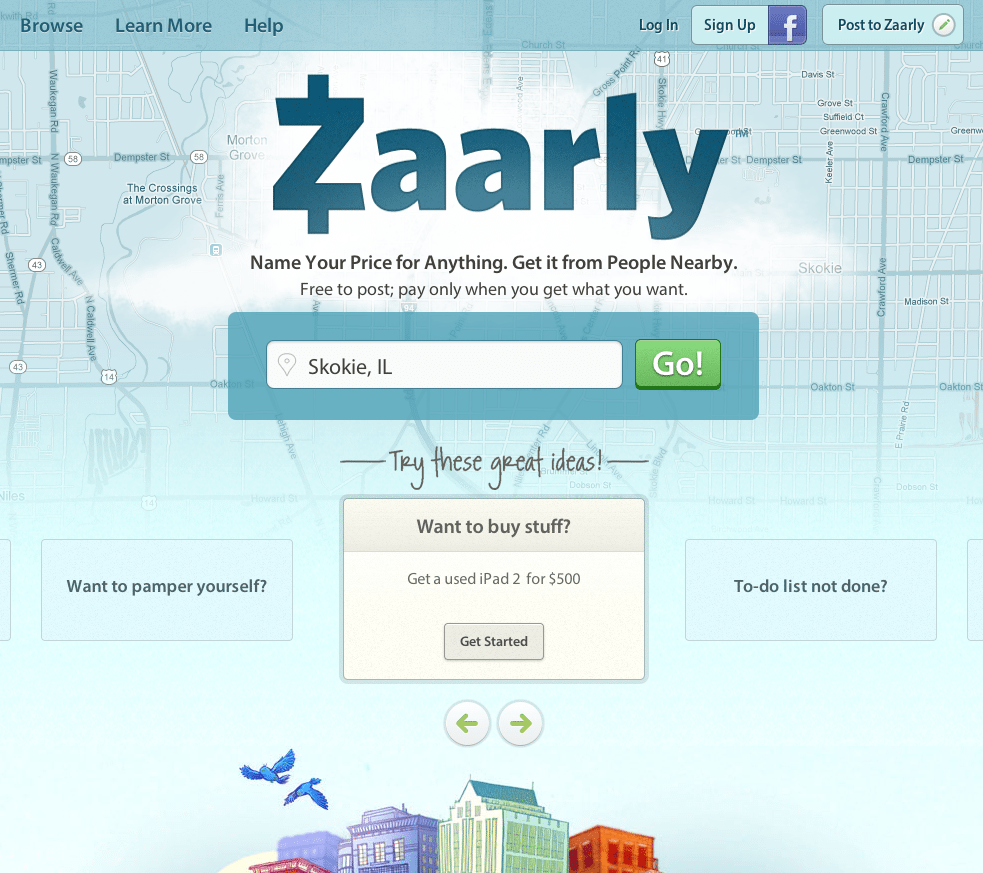
So let’s swing on over to their landing page and see what we find.

Here’s why Zaarly’s landing page made our list of best landing page designs:
- Design success. From the map to the bluebirds to the composition, this landing page is just plain nice to look at.
- Keywords. I don’t know about you, but under pretty much any context the words “anything” “nearby” and “free” are bound to catch my eye (and mouse click).
- Facebook login. Sometimes filling out a form is just too much to ask a lackadaisical human like myself. One-click Facebook login solves that problem.
- Examples. In case you don’t get the concept, a tantalizing example is sure to do the trick. “Get a used iPad 2 for $500?” Count me in.
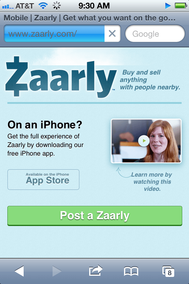
 Good stuff. But it’s a mobile app, so aren’t users more likely to navigate this site on their smartphones?
Don’t worry – they thought of that too. The mobile landing page is friendly, easy to navigate and even points users to the mobile app for a prime Zarrly-ing experience.
A well-structured landing page is key in getting users to take that next step – whether it’s signing up for your email list, “liking” your Facebook page or clicking to your website. Each week, lonelybrand highlights a killer landing page design that gets the job done.
Have a favorite landing page that you’d like us to feature on the lonelybrand blog? Let us know by commenting below or connecting with lonelybrand on Twitter. Want landing page optimization tips? Look no further than our ‘Landing Pages 101′ white paper.