Whether it’s on purpose or a happy accident, when consumers land on your page, you’ve got a limited amount of time to reel them in. A well-structured landing page is key in getting users to take that next step – whether it’s signing up for your email list, “liking” your Facebook page or clicking to your website. Each week, lonelybrand highlights a killer landing page design that gets the job done.

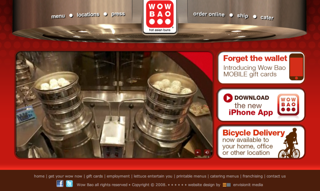
If you’ve strolled through Water Tower Place in Chicago your nose has probably been tantalized by the smell of Wow Bao’s hot asian buns. Turns out their landing page is just as tasty.
Here’s why Wow Bao made the list of Best Landing Page Designs:
- Moving pictures – For those too hungry to read, Wow Bao delivers an aesthetically pleasing (and mouthwatering) slideshow to explain what they are all about. It’s an elegant way to show more data without requiring more clicks.
- Simple design – The homepage is built around a simple design so users aren’t overwhelmed with images and words. With just four key areas to focus on, the viewer’s eyes aren’t tempted to wander.
- The mobile connection – For a mobile campaign to work, it needs to be integrated into other platforms. It only makes sense to promote your mobile gift cards and apps front and center.