Whether it’s on purpose or a happy accident, when consumers land on your page, you’ve got a limited amount of time to reel them in. A well-structured landing page is key in getting users to take that next step – whether it’s signing up for your email list, “liking” your Facebook page or clicking to your website. Each week, lonelybrand highlights a killer landing page design that gets the job done.

“Music is better with friends” is the mantra over at Turntable. This music-based social network revolves around listening to music with others, and can be an extremely addicting way to find and share songs.
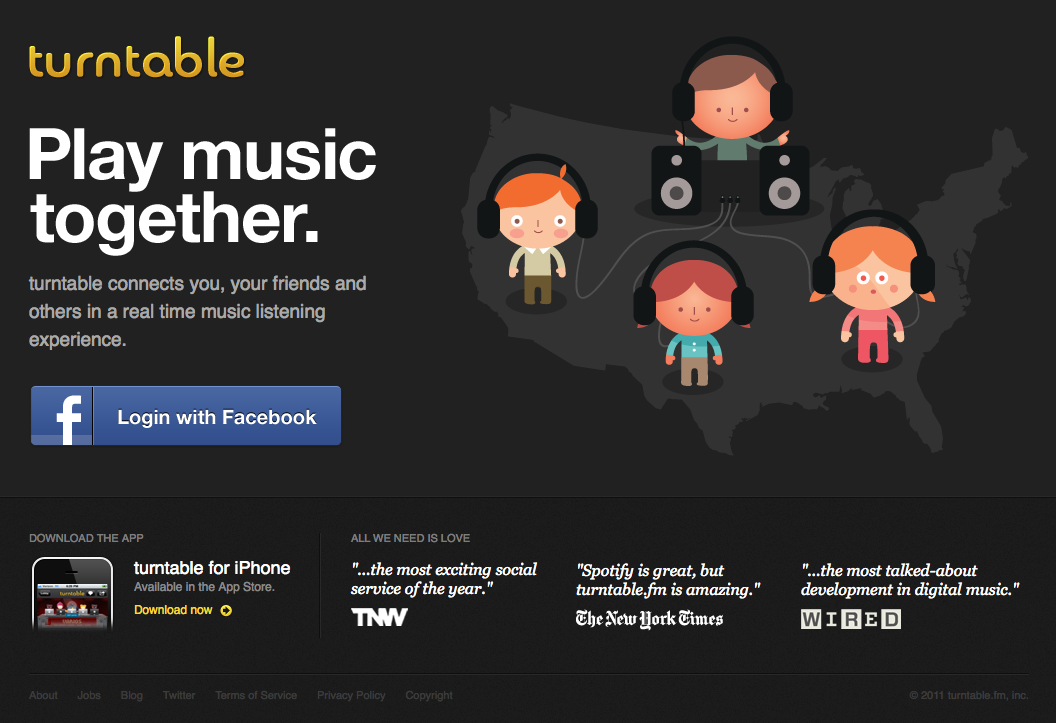
DJ Points, avatars and new tunes aside, the folks at Turntable have a nice looking landing page that we’d like to share. Here’s why it made our list of Best Landing Page Designs:
- Those cute little avatars aren’t just for looks – they nicely illustrate exactly what the service does: connect people with music. If you missed that message, they also spell it out in giant letters: “Play Music Together”
- Testimonials from major publications – words of praise from The Next Web, New York Times and Wired can’t really be ignored
- Quick, Facebook-based login – with a service like this, getting started with a single click on a Facebook dialogue box is far more appealing than filling out a million boxes
- Link to mobile app download – the landing page is a great place to plug the fact that this service can be used on the go, too