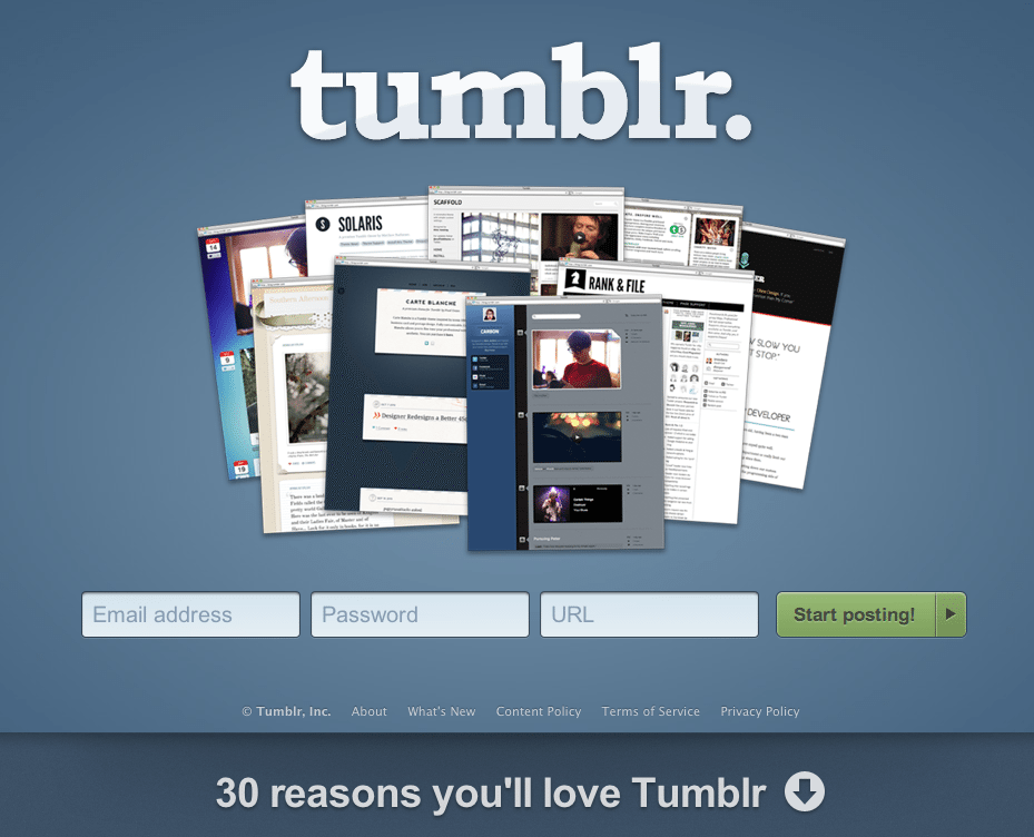
We know and love a Tumblr page when we see it, so it’s no surprise that their landing page amounts to an equally pleasant combination of aesthetics, simplicity and functionality.

Here’s why the popular microblogging platform’s landing page made our list of Best Landing Page Designs:
- Consistent branding. Tumblr is known for its simple aesthetics, and their landing page is no exception.
- 3 boxes later… Starting a blog couldn’t be any easier.
- 30 reasons you’ll love Tumblr. Tempting, right? It’s not easy to get viewers to scroll down, but content that is quick and easy to consume gets the job done.
Whether it’s on purpose or a happy accident, when consumers land on your page, you’ve got a limited amount of time to reel them in. A well-structured landing page is key in getting users to take that next step – whether it’s signing up for your email list, “liking” your Facebook page or clicking to your website. Each week, lonelybrand highlights a killer landing page design that gets the job done.
Have a favorite landing page that you’d like us to feature on the lonelybrand blog? Let us know by commenting below or connecting with lonelybrand on Twitter. Want landing page optimization tips? Look no further than our ‘Landing Pages 101′ white paper.
