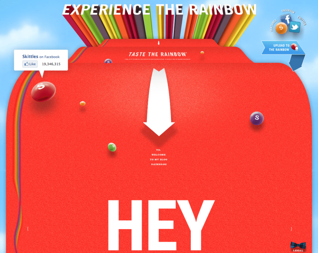
Whether it’s on purpose or a happy accident, when consumers land on your page, you’ve got a limited amount of time to reel them in. A well-structured landing page is key in getting users to take that next step – whether it’s signing up for your email list, “liking” your Facebook page or clicking to your website. Each week, lonelybrand highlights a killer landing page design that gets the job done.

Check out this week’s sweet edition of Best Landing Pages. Oh yeah, we went there.
Here’s why Skittles made the list of Best Landing Page Designs:
- No space waste. This landing page uses every pixel of space on your screen. Plus, the illusion of riding the rainbow is a good time for everyone.
- Social links. Skittles throws in social links not once but twice. Take a look at that number – if your page had 19,346,315 Facebook likes, you’d advertise it on your landing page, too.
- Audience participation. The “Upload to the Rainbow” button in the top right corner invites viewers to submit photos and videos of their own. Offering to post the best entries on their website creates a feeling of community that anyone can be a part of.
Which landing pages do you dig? Let us know by commenting below or connecting with lonelybrand on Twitter. Want landing page optimization tips? Look no further than our ‘Landing Pages 101’ white paper.