The latest version of mobile app Path hit the App Store shelves a couple of weeks ago. It’s meant to be a “share everything” mechanism – share photos and videos, where you are, the music you’re listening to, what you’re thinking and even when you wake up and go to sleep.
Sounds creepy, right? But there is one important difference about Path: it was built to share with close family and friends – not that kid that may or may not have gone to high school with you. Users are actually only allowed to share this life journal with 150 people. Not that I’d want 150 people to be alerted when I wake up every morning.
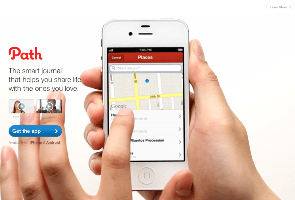
Anyway, it’s a cool app that needs a thorough explanation, but what we really want to share is their landing page. The screen shot doesn’t do it a ton of justice, so you might want to visit Path’s actual landing page, which is now defunct.
Here’s why Path made our list of Best Landing Page Designs:
- Seeing is believing. Upon hitting the page you’ll see a hand holding an iPhone, scrolling through the basics of the app. Why talk about the app when you can show it?
- 3 video options. There’s the main video on the iPhone screen, but there are also options to watch a demo and an ad.
- The right links. Users can click to “learn more” or “get the app” without any other page clutter.
Whether it’s on purpose or a happy accident, when consumers land on your page, you’ve got a limited amount of time to reel them in. A well-structured landing page is key in getting users to take that next step – whether it’s signing up for your email list, “liking” your Facebook page or clicking to your website. Each week, lonelybrand highlights a killer landing page design that gets the job done.
Have a favorite landing page that you’d like us to feature on the lonelybrand blog? Let us know by commenting below or connecting with lonelybrand on Twitter. Want landing page optimization tips? Look no further than our ‘Landing Pages 101′ white paper.