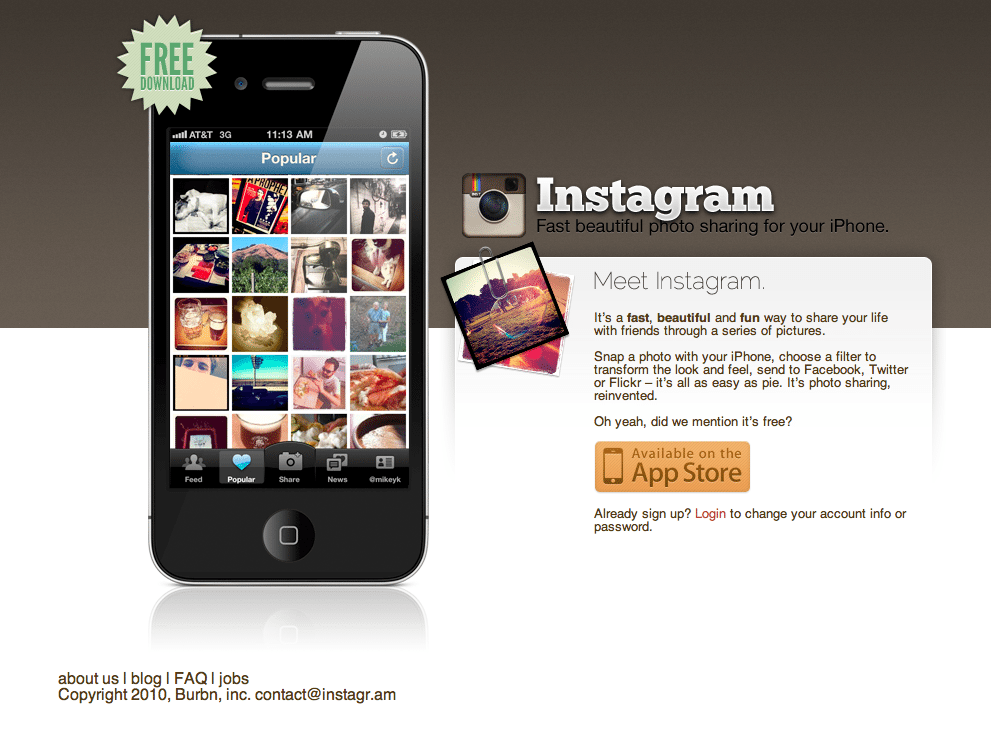
We are huge Instagram fans here at lonelybrand. It’s a fun application for users and an effective marketing tool for brands. What more could you ask for? How about an equally awesome landing page.
Here’s why Instagram’s landing page made our list of Best Landing Page Designs:
- Minimal text. There are a million things to be said about Instagram, but wisely they keep the text to about 50 words.
- Highlight the benefits. FREE DOWNLOAD. Enough said.
- Simple design. There’s no confusion about where to look on this page. A simple design and limited calls to action make the user’s job easy.

Whether it’s on purpose or a happy accident, when consumers land on your page, you’ve got a limited amount of time to reel them in. A well-structured landing page is key in getting users to take that next step – whether it’s signing up for your email list, “liking” your Facebook page or clicking to your website. Each week, lonelybrand highlights a killer landing page design that gets the job done.
Have a favorite landing page that you’d like us to feature on the lonelybrand blog? Let us know by commenting below or connecting with lonelybrand on Twitter. Want landing page optimization tips? Look no further than our ‘Landing Pages 101′ white paper.
