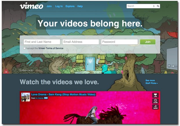
You’ve probably encountered video-sharing site Vimeo at one point or another in your countless quests throughout the Web. Vimeo is a much smaller network than YouTube, but gives users a bit more control when it comes to the look and feel of videos. But we like Vimeo for their warm and welcoming landing page. Here’s a look at why they earned a spot on our list of Best Landing Page Designs.

“Your videos belong here.” What more do you need than this friendly invitation? The dream world illustration of an outdoor Vimeo theatre doesn’t hurt the welcoming feel, either.
Form simplicity. Signing up is a matter of filling out three simple fields: Name, Email Address and Password. Speed and simplicity are key for users with short attention spans, and this is especially true when they’re already en route to entertaining content.
Content peeks through. It’s always wise to give visitors a preview of the the top-notch content they’ll get from your site. Vimeo jumps right into the video reel with a collection of staff-selected picks. It’s also important to note that the form lives above this content, with the hope that users will take a few seconds to sign up before jumping into hours upon hours of awesome video.
Are you a Chicago startup with a killer landing page? We want to feature you on our list of Best Landing Page Designs! Shoot me an email at katherine.l(at)lonelybrand.com. And for landing page optimization tips, look no further than our ‘Landing Pages 101′ white paper.