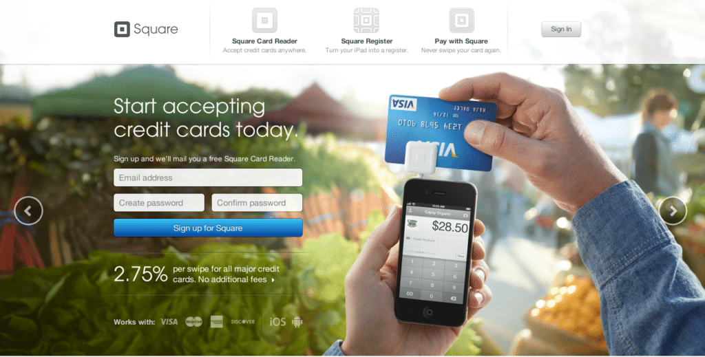
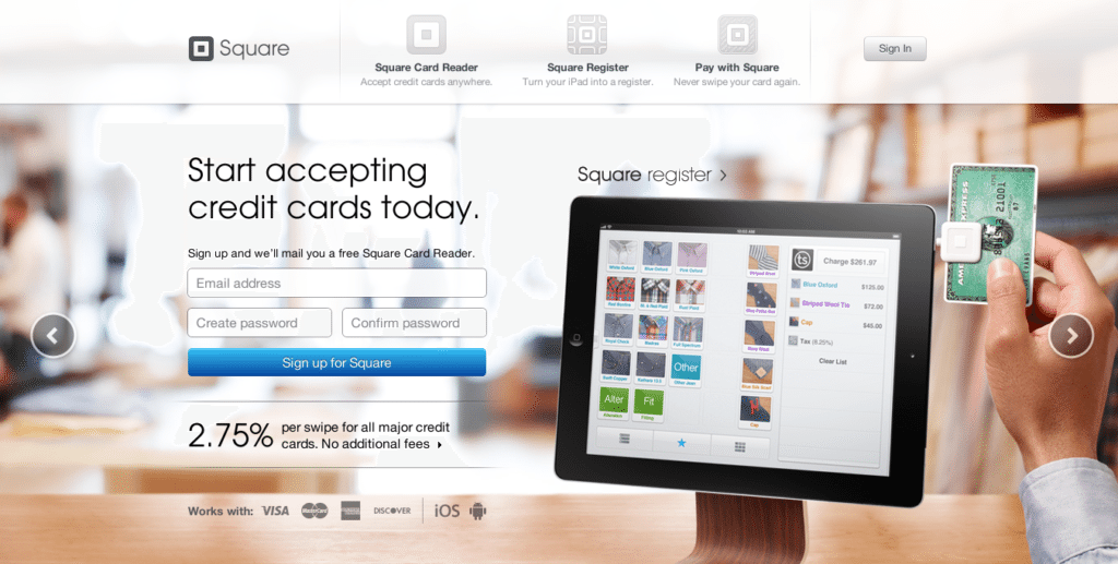
Electronic payment service Square makes it easy to accept payments from just about anywhere. It turns out that getting more info about the product is just as simple.
Here’s why Square made our list of Best Landing Page Designs:
- No danger of going below the fold. The rectangular setup fits everything above the fold, keeping short attention spans focused on what matters.
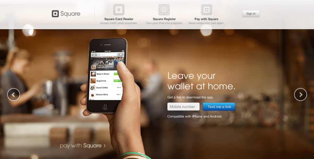
- Slider displays device capabilities. Users can click arrows on the left and right to scroll through scenes of Square at work in different contexts.
- Caters to mobile. Rather than a signup prompt, the final slide asks for the user’s mobile phone number, which will send a link to download the app directly to your phone.


Have a favorite landing page that you’d like us to feature on the lonelybrand blog? Let us know by commenting below or connecting with lonelybrand on Twitter. Want landing page optimization tips? Look no further than our ‘Landing Pages 101′ white paper.
