MailChimp is an email marketing service known for its easy-to-use interface and captivating mascot (just for fun, here’s the story of the evolution of MailChimp’s logo).
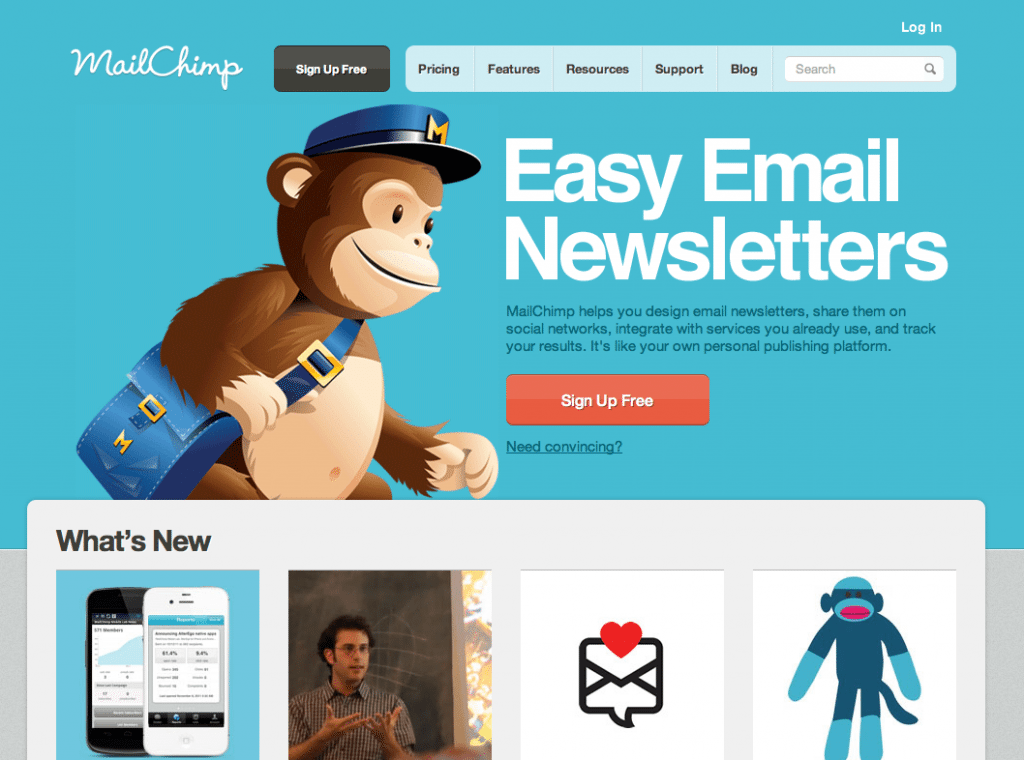
Here’s why MailChimp’s homepage made our list of Best Landing Page Designs:
- Big, self explanatory text. Easy Email Newsletters really gets the point across, and it’s supported by further text below and a “Need Convincing?” link with further resources for wary vistors.
- What’s New? We see images of 4 new product elements, which are there to spark curiosity and (hopefully) convince users to scroll down for more information.
- Helpful Blog. In the top menu, we see a link to a blog that is updated multiple times a week with helpful email marketing tips.

Sellin’ it below the fold
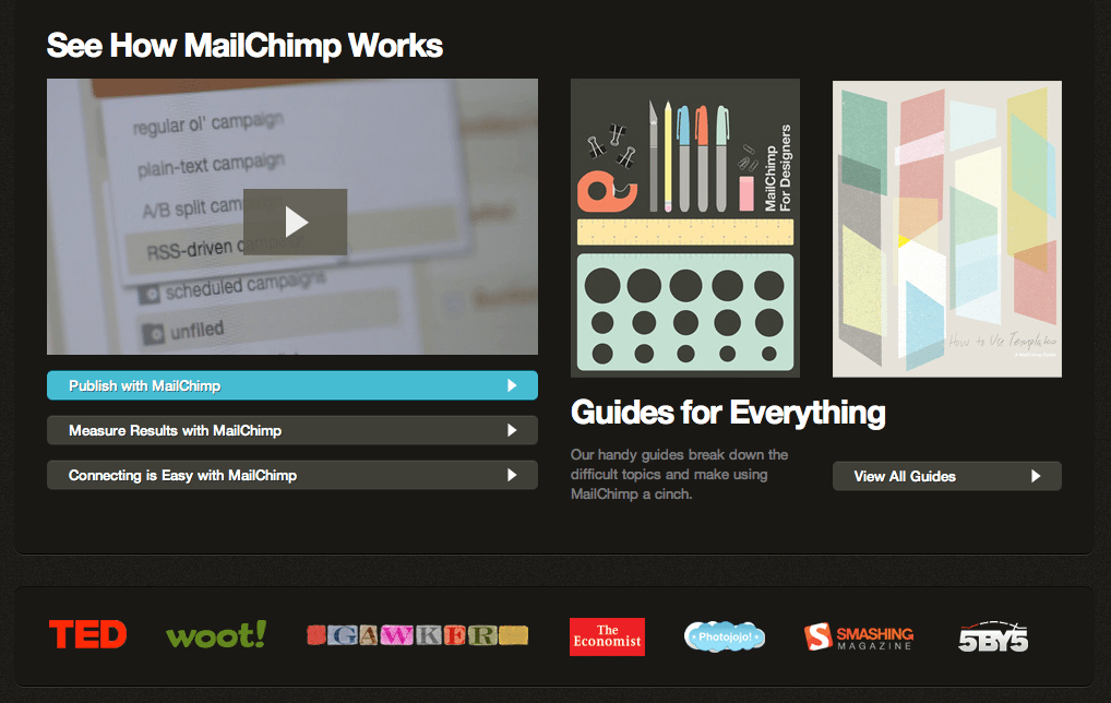
Below the fold, MailChimp really pushes the helpful resources angle, from an intro video about the product to links to “handy guides [that] break down the difficult topics and make using MailChimp a cinch.” You can view all of these materials before you even sign up to see for yourself if they’re actually helpful.

Have a favorite landing page that you’d like us to feature on the lonelybrand blog? Let us know by commenting below or connecting with lonelybrand on Twitter. Want landing page optimization tips? Look no further than our ‘Landing Pages 101′ white paper.
