As an avid traveler and a visually-oriented person, my late in-the-game discovery of Hipmunk was quite the goldmine of a find. The travel site focuses on a visual organization of flight and hotel search results, even bringing in eclectic and affordable results from Airbnb.
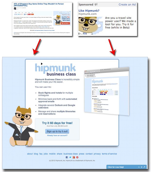
User-friendly travel accommodations aside, we’re here to talk about the landing page experience behind their new tool, Hipmunk Business Class. Currently in beta mode, the paid tool was created to make the company travel booking experience easier. As you can see below, they’re currently promoting the service with advertising on sites around the web including Mashable and Facebook.

Here’s why we like this particular paid media-backed landing page experience:
Don’t dump users on the homepage. Dropping ad-clickers onto Hipmunk’s regular old homepage would cause nothing but confusion. This landing page caters specifically to those wanting to learn more about the Business Class program, with a singular “Sign up to try it out!” call to action.
Free trial. Adding a paid component to a normally free service can push consumers away, but offering a trial period soothes this discomfort and gives users a chance to see what they’re missing.
Bulleted description with screenshot. By the time any office manager gets through those four bullets, they’ll see that this tool can make their job a whole lot easier. And a screenshot is always helpful for us visual-oriented people.
Are you a startup with a killer landing page? We want to feature you on our list of Best Landing Page Designs! Shoot me an email at katherine.l(at)lonelybrand.com. And for landing page optimization tips, look no further than our ‘Landing Pages 101′ white paper.