Facebook Ads can be a great way to reach current and new fans and customers, but they can be a budget drainer if you take the jump without a plan of action. Fortunately, there are a few easy to follow best practices that can exponentially increase your ads’ effectiveness.
Bright colors get noticed
The muted nature of Facebook’s pale blues and whites just beg for a pop of color, so bring that color with your ad photo choices. Photos with bright, vibrant and attractive colors get noticed more and are more pleasing to the eye than drab and muted photos or photos that have the same color palette as Facebook’s site itself. You can also boost the colors, brightness and contrast of a photo you already have using photo-editing software (like Photoshop). ModCloth’s inventory makes it easy for them to create attention-grabbing ads, but they take it up a notch by adding colors that contrast or complement the product featured, like the pink party dress highlighted by a bright baby blue below.
 Include a clear call to action
What is it that you’re trying to get your fans/potential customers to do? Like your page? Become a member of your site? Shop your sale? Be sure to communicate that clearly in your ad copy. Using language like “Click here to learn more about our 50% off sale” tell your customer what to do (click here) and why they should (50% off sale). The ad for “Oz the Great and Powerful” is a great example of this. The first line tells the viewer exactly what to do: Watch the brand new trailer.

Get ready for your close-up
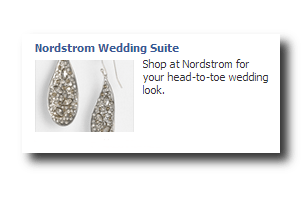
Depending on the nature of your brand, your ad photos could be stock images or shots of actual products that you sell. Although close-ups of friendly, attractive faces tend to perform better, what’s important is finding a photo that is relevant to your brand, the ad and/or the product/service you sell. If you feature a product, give it the best showcase possible by keeping it simple, clear and easy to recognize. The Nordstrom ad below features a creatively shot photo that is interesting to look at without being confusing, and it also relates back to the headline and the body copy of the ad.

Spotlight your brand
Brand awareness is extremely important and one of the ways to build awareness for your brand is by putting it front and center in your Facebook ads. Highlight your brand name and be consistent in the imagery you use to help build that brand recognition among Facebook users and potential customers. We sang Ancestry.com’s praises previously for the brand’s awesome presence on Pinterest, now we’re featuring them for the steps they’ve taken to build brand awareness. Many Facebook ads are too ambiguous, but Ancestry.com features their brand name in the headline, their URL display line and the photo itself — making the brand association very easy.
What Facebook ad tips have helped get your brand noticed? Share them with us!
