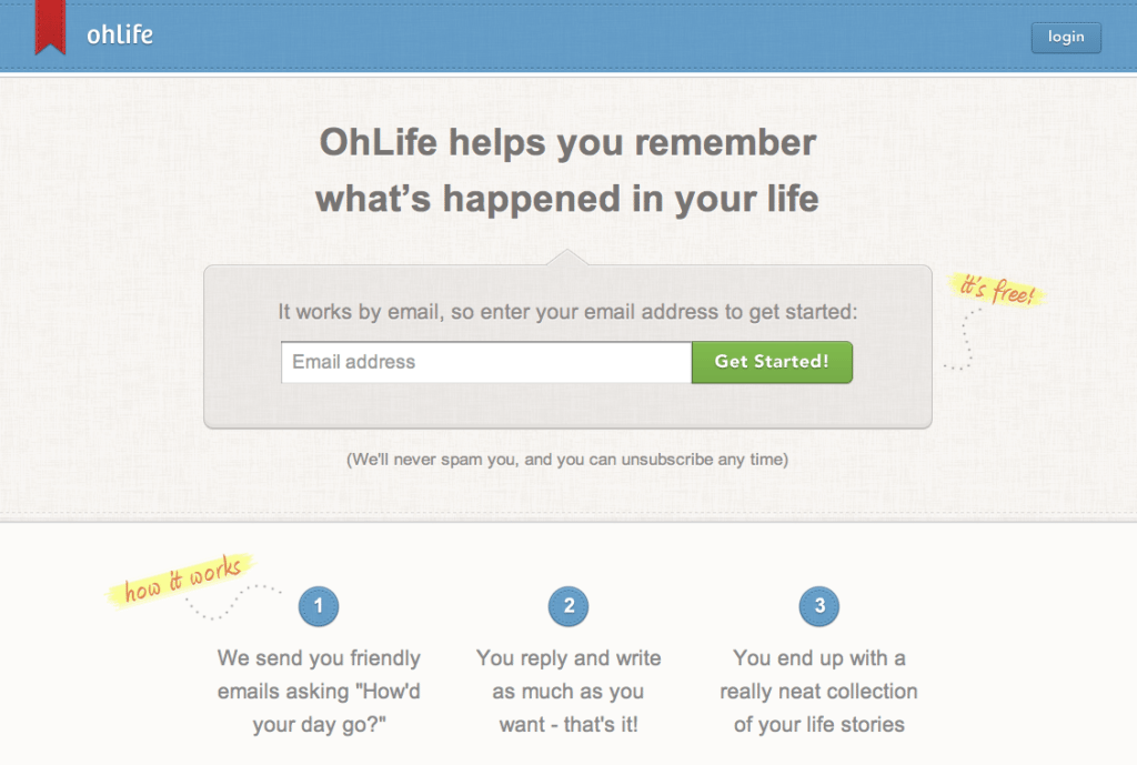
In this week’s edition of Best Landing Page Designs we cover OhLife, an online journaling service for documenting the special and/or mundane events in your life. In their own words, OhLife is “not a social network or a blog – it’s a place for you to privately remember memorable days.” Privacy, how about that?
Here’s why OhLife’s landing page made our list:
- 3 steps. OhLife provides more information on what their service does in three quick, easy-to-digest steps.
- Privacy policy. It’s important that visitors know how their data will be used. The “we’ll never spam you, and you can unsubscribe at any time” line reduces friction by giving potential subscribers some peace of mind.
- Logical layout. It’s important to minimize distractions on a landing page. Luckily there are only so many places for a user to look and click on this page, and the call to action lies front and center.

Whether it’s on purpose or a happy accident, when consumers land on your page, you’ve got a limited amount of time to reel them in. A well-structured landing page is key in getting users to take that next step – whether it’s signing up for your email list, “liking” your Facebook page or clicking to your website. Each week, lonelybrand highlights a killer landing page design that gets the job done.
Have a favorite landing page that you’d like us to feature on the lonelybrand blog? Let us know by commenting below or connecting with lonelybrand on Twitter. Want landing page optimization tips? Look no further than our ‘Landing Pages 101′ white paper.