Whether it’s on purpose or a happy accident, when consumers land on your page, you’ve got a limited amount of time to reel them in. A well-structured landing page is key in getting users to take that next step – whether it’s signing up for your email list, “liking” your Facebook page or clicking to your website. Each week, lonelybrand highlights a killer landing page design that gets the job done.

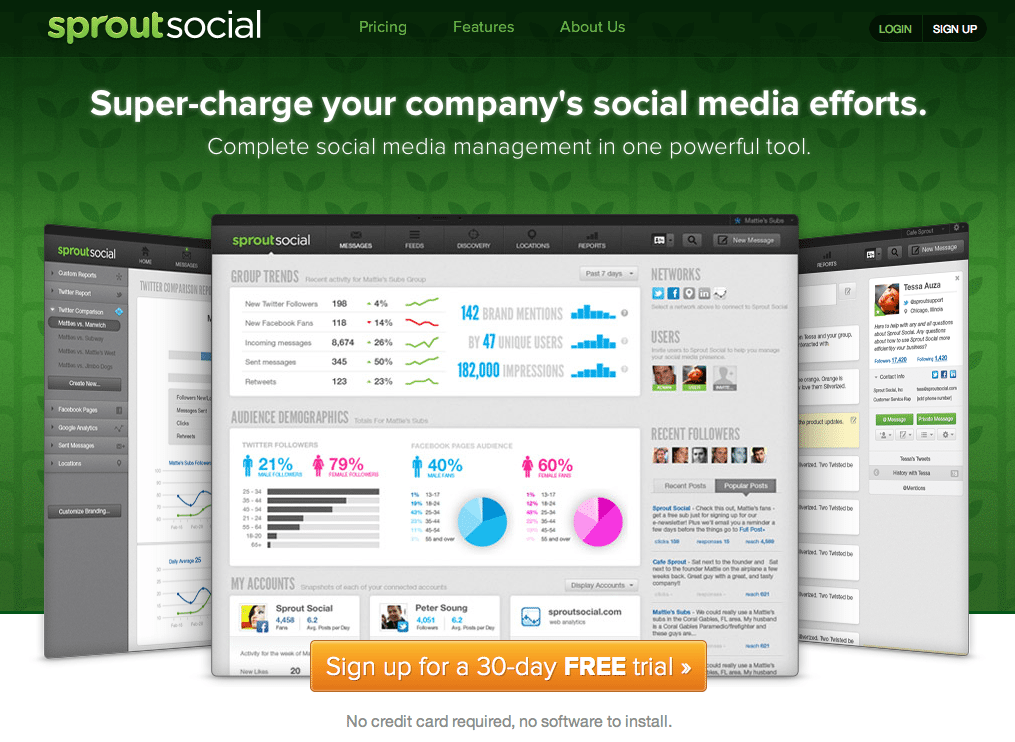
We dig Sprout Social because they’re a Chicago tech success story. Now we’ve got another reason to add to the list: sweet landing page.
Here’s why Sprout made our list of Best Landing Page Designs:
- A tempting call to action. Who doesn’t like a 30-day, no credit card required free trial?
- Tell me what I need to know. The top three links are what everyone is bound to be looking for: Pricing, Features and About Us. These should always be easy to find.
- Layout preview. Look no further than the landing page to get a nice glance at what you’ll get with the tool.
Have a favorite landing page that you’d like us to feature on the lonelybrand blog? Let us know by commenting below or connecting with lonelybrand on Twitter. Want landing page optimization tips? Look no further than our ‘Landing Pages 101′ white paper.