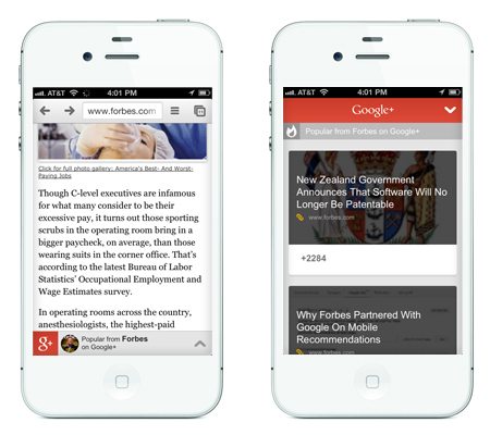
 From Disqus Recommendations to Facebook Reommendations, there are a number of mechanisms used to keep desktop readers around by tempting them with related articles. But until now, those options were fairly limited on the mobile front.
A Monday post on the Google Plus Developer’s Blog introduced the new content recommendations feature built specifically for mobile. Recommendations appear within a subtle bottom banner as visitors scroll through articles or blog posts. Readers can click on this mobile recommendations bar to expand suggestions, including articles from the same author, or other popular articles. If the user is signed into Google, they can see articles +1’d by people in their Google Plus Circles.

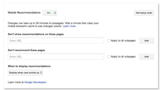
Setup for the new feature is easy. Simply add a single line of javascript to your mobile site (details here), then make any desired adjustments in the Settings > For Your Site section of your Google+ page dashboard. From here, you can customize the experience, setting up criteria such as “Don’t show recommendations on these pages” as well as “don’t recommend these pages.” You can also select when to display articles, for example when the user scrolls up or scrolls past an element with a specified ID.
The feature is simple and clean, although I did notice a bit of interference with the mobile banner ads on Forbes, which land in the same space as the recommendations bar. For a closer look at what the new feature looks like, check out articles via mobile on lonelybrand.com by scanning through an article then scrolling up.
