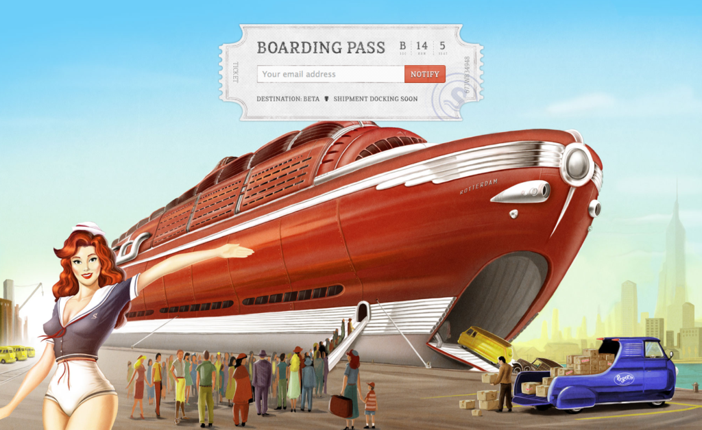
Whether it’s on purpose or a happy accident, when consumers land on your page, you’ve got a limited amount of time to reel them in. A well-structured landing page is key in getting users to take that next step – whether it’s signing up for your email list, “liking” your Facebook page or clicking to your website. Each week, lonelybrand highlights a killer landing page design that gets the job done.

We’ll be honest here – this app made the list because it’s just plain nice to look at. Let’s take a closer look at why this made our list of Best Landing Page Designs:
- Pretty Picture – this image takes viewers to a different era. And good news – the Shipment App landing page was so popular that the developers made this image available for download on their blog.
- Boarding Pass – Users are invited to sign a boarding pass, not enter their email address. That would just be boring.
- A Bit of Mystery – One of the most enticing parts of a stealth landing page is that you don’t quite know what the product is. Judging from the title, we know that the product is an application for designers. The rest is up to our wandering imaginations.
Which landing pages do you dig? Let us know by commenting below or connecting with lonelybrand on Twitter. Want landing page optimization tips? Look no further than our ‘Landing Pages 101′ white paper.