Building a landing page for a complex product or service requires more than seemingly unrelated fun and games. College degrees and pricey B2B software aren’t one and done purchase decisions because visitors will understandably require extensive information before taking that next step. In these scenarios the landing page experience will not result in an immediate purchase. Rather, this is a first, research-intensive step in a longer sales cycle.
To communicate a solid understanding of your product to inquisitive visitors, consider including these five landing page elements.
Thorough product information
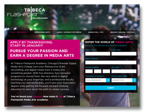
At this point, visitors want information on the industry, brand or product. Brands can deliver these initial details via text, video or imagery. In the example below, rather than giving a fluffy description of its program, Tribeca Flashpoint communicates important details in a text block.

Additional materials available for download
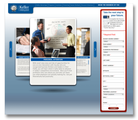
It’s important to provide the tools for visitors to jump into extensive independent research on your product or service. Putting relevant white papers, e-newsletters and mailings behind a lead generation form not only helps users start the research process, it gives you an opportunity to collect important contact info from the prospect. In the example below, Keller Graduate School of Management offers visitors a white paper called “Career Success.”

Put the microsite experience into one landing page
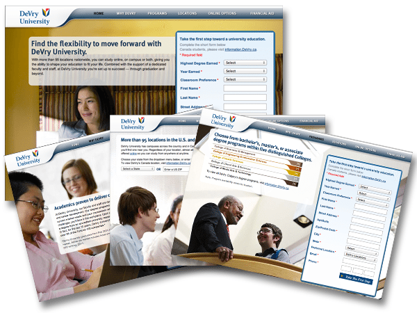
If you need to communicate a large amount of information, consider implementing a series of landing pages. In the example below, DeVry University uses a jQuery slider to turn multiple pages worth of information into a unified, one-page experience. When a visitor clicks on one of the tabs on the top, new image and text appear without refreshing the screen, creating an uninterrupted but information-rich experience.

Share testimonials
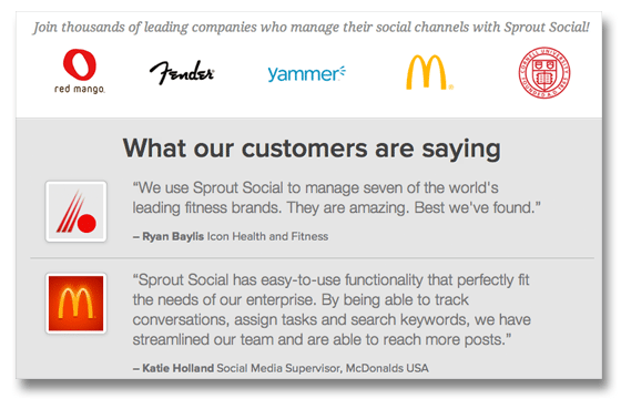
Studies show that customer testimonials are the most effective form of content for driving conversions, and can build trust with prospective customers. But in this age of fake Yelp reviews, remember that we all take glowing reviews with a grain of salt. Add marks of legitimacy wherever possible, such as recognizable logos, names and job titles. In the example below, Sprout Social provides reviews from real people at real companies.

Display trust icons
Familiar logos can put visitors at ease. If you’ve won notable awards or seen any big name press coverage, these icons can add credibility to your page. Below, SurePayroll notes press coverage in PC Magazine, Software CEO, Inc. and others.
![]()
For more tips on building landing pages that meet customer needs, download our free landing page needs assessment tool.