A host of community-based e-commerce, travel and social sites have cropped up in the last few years, but few are offering what Airbnb offers. The site, founded in 2008, is a community marketplace for people to list, discover and book unique accommodations around the world. Apartments, villas and castles are all included and the way the site is designed perfectly showcases these unique destinations.
Here’s why Airbnb made our list of Best Landing Page Designs:
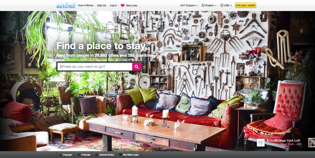
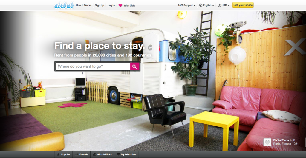
Central, hi-res featured photo – Airbnb is clearly proud of the choices its marketplace users have available, and nowhere is this more evident than the fact that the site features photos of these destinations as its central image. If you’re trying to decide where to stay in Tokyo, a beautiful splash image may be all it takes to close the deal. What’s more, every destination featured also includes a caption of its location and its lister. Talk about eye candy!
“Find a place to stay.” – That one sentence perfectly sums up the purpose of the site, even for someone who has unknowingly stumbled across it. It also draws attention to the search box, and is followed by the amount of cities and countries covered (26,893 and 192 respectively), immediately assuring users that chances are very good their city is covered.
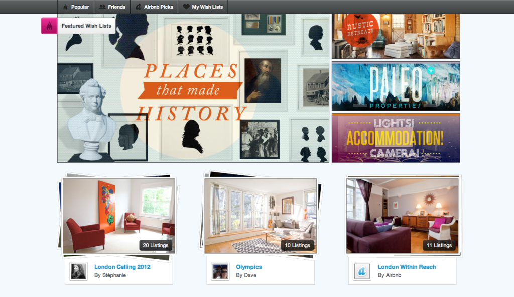
Wish lists – Even if you’re not planning on taking a trip soon, simply browsing the wish lists causes you to start daydreaming. Anyone who is skeptical about the variety of flats and villas available need only browse a wish list or two before being completely sold on the concept. The fact that this link is also listed above the fold, is an excellent design choice.
Have a favorite landing page that you’d like us to feature on the lonelybrand blog? Let us know by commenting below or connecting with lonelybrand on Twitter. Want landing page optimization tips? Look no further than our ‘Landing Pages 101′ white paper.


