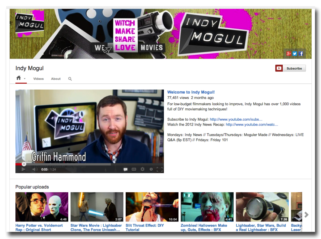
Looking to revamp your YouTube channel page? Now is the perfect time, as YouTube has just introduced a new format for channel pages. Here are the major changes to take note of, with Indy Mogul as our guide.
New cover photo
Like Facebook and Google Plus before it, YouTube’s channel pages are getting into the cover photo spirit. By switching to the new look, background images are forfeited in favor of a cover image. Overlapping this image are a small profile image in the upper left corner, as well as links to the brand’s various social accounts in the bottom right corner.
Channel art scales to all device screens
The hard work you put into designing your new cover photo isn’t wasted, because the screen automatically scales fit mobile, tablet and desktop devices. This helps keep your channel looking good while helping drive brand recognition and awareness.
Promo video automatically plays for non-subscribers
With this new update also comes the opportunity to perfect your brand’s first impression. When a non-subscriber stumbles across your page, they’ll be greeted with a trailer or promo video to help turn them into subscribers. Viewers who are already subscribed will instead be greeted with categories like Recent Activity, Recently Watched and What to Watch Next.
You can get the new look by going here, and get the photo specifications by going here.
Photo courtesy of Jorge Barrios Riquelme

