

An interesting little secret was revealed this week. When no one was watching, the team at Facebook quietly changed the social network’s guidelines concerning page cover photos. Instead of listing unacceptable forms of language or statements within cover photos, the guidelines now only state that the photos should have no more than 20% text (keeping consistent with the text rules for other imagery). Although that opens up a new world of advertising for brand marketers, it also means that it should be approached with strategy, caution and a lot of thought.
Visualize the 20% rule.
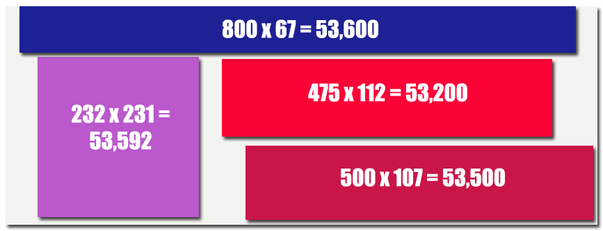
It can be difficult to envision what 20% of an image might look like, especially when it involves text being superimposed onto an image. The easiest way to determine what kind of space and dimensions you have to work with, is to do a little math. If the dimensions of Facebook cover photos are 851 x 315, then that means you have 268,065 total square pixels to deal with; 20% of that amount is 53,613 square pixels. Although all 20% of your text does not need to be contained within one area of your cover photo, designing it this way might help you plan around it and keep it neat and easy to read. I’ve laid out a few examples of how this block of text might look within that cover image, with all falling under that 53,613 square pixel restriction.
Get creative with your calls to action and image, in general.
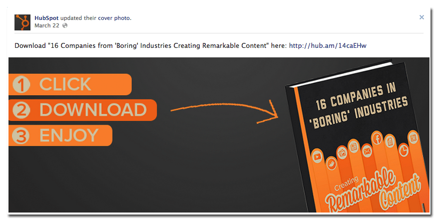
Once you’ve nailed the proper image to text ratio, the challenge is going to become writing creative calls to action that will inspire action without annoying fans and followers by being blatant advertising. HubSpot, one of the first sources to notice the cover photo guidelines change, was quick to start playing with their own cover image. Instead of using it to sell their services, they used it to encourage followers to download one of their ebooks. Not only will they get a better response from this design and wording than they would with a straight-up sales pitch, it also looks more attractive as their cover image than a standard ad.
Keep it short, direct and include the destination.
You don’t have much space to work with, so it’s important to use it wisely. For example, instead of announcing their new spring line, a fashion brand might simply update their photo to models wearing the latest line with the call to action “Get the look.” Of course, no matter how good your call to action is, you need to make sure that your fans are able to get to your intended destination. Since the natural reaction to seeing such an offer in a cover photo is to then click on it, make sure that you have provided additional directions and a url to the desired destination in the description of the photo itself.
Need to brush up on the guidelines for other Facebook images and text? We’ve got all the details here.