A few nights ago a friend and I sat at a neighborhood bar in River North. As our happy hour beers grew empty, we decided we should keep the night going and grab dinner afterwards.
“So where to?” we asked.
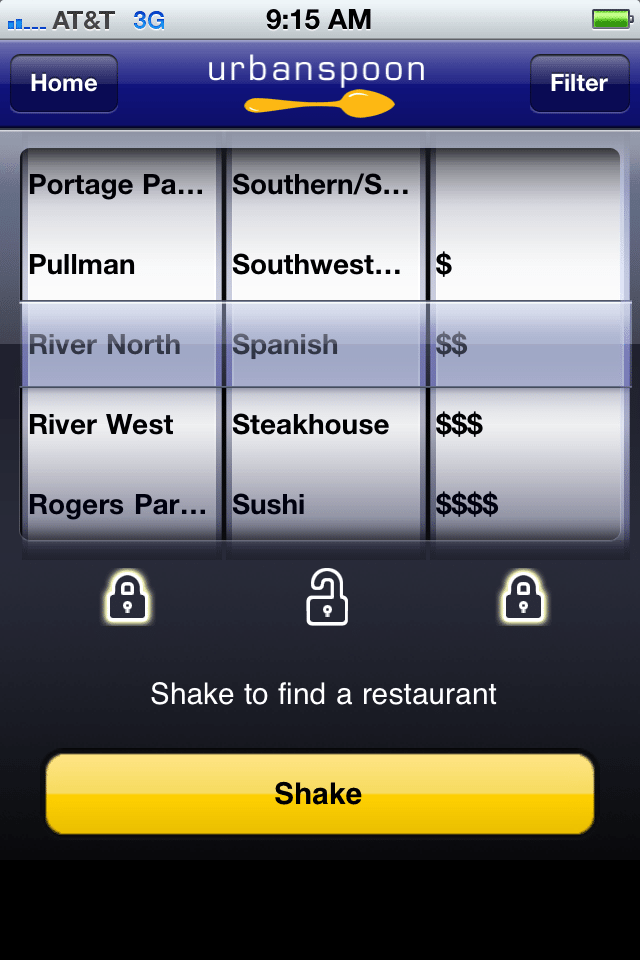
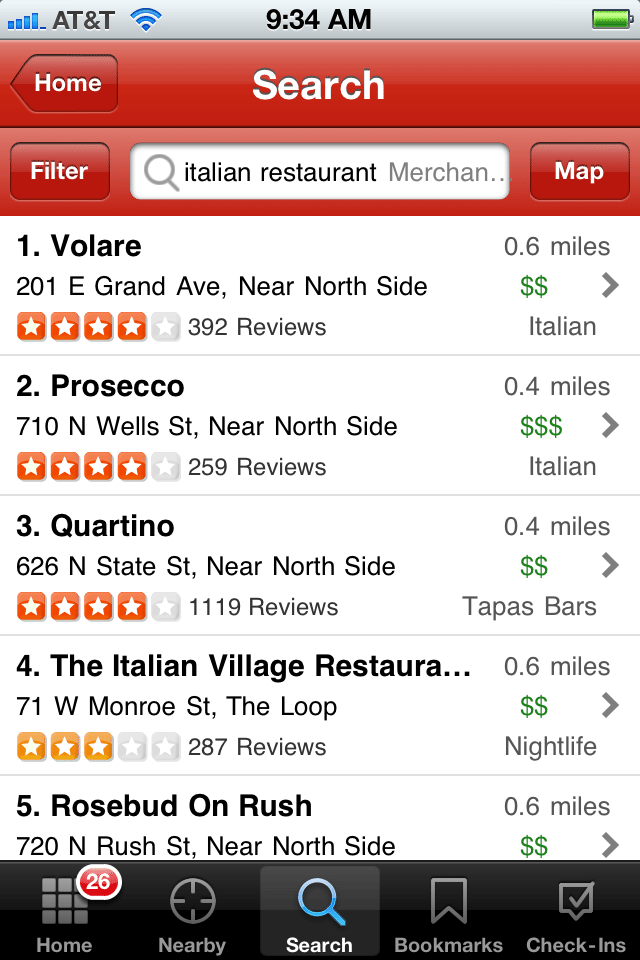
Being the millennials that we are, we ponder the question for all of two minutes before deeming this search useless without mobile assistance. Sitting across the table from each other, we both bust out the iPhones and open our respective dining apps of choice. For him, it’s review-based Yelp. For me, it’s Urban Spoon (I’m still a sucker for that slot machine set-up).


Within a few minutes, we each find a restaurant. Him, a little Italian dive down the street. Me, a hip-sounding tapas place on the very same same block.
But we’ve yet to reach a conclusion. So we follow links to our respective restaurant websites for decision-making details: menu, price and ambiance. For him, the information pursuit is immediately successful.
For me, not so much. I follow the link. I wait. And wait. Finally, it looks like I’ve landed on an elaborate flash site, which is all fine and dandy (yet still a bit obnoxious…) for your desktop user. For a mobile user with minimal patience and a small screen, it’s a deal breaker. No directions, no phone number, no menu. Just a black hole with a stubbornly motionless download bar.
Guess which restaurant we picked?
Mobile optimization matters for restaurants
People of all ages in a big city full of dining options default to mobile devices for appetite guidance. According to a recent Google report, 30% of searches in the restaurant vertical come from mobile devices.
Having a presence and positive reviews on popular dining apps like Yelp and Urban Spoon is important, but good followthrough is what makes the sale. Consumers want to make informed decisions, and they rely on mobile devices to acquire that information. If a restaurant doesn’t make the information-gathering process as easy as possible, potential customers are going to frustratedly opt for the restaurant next door.
How does your website perform on mobile devices?
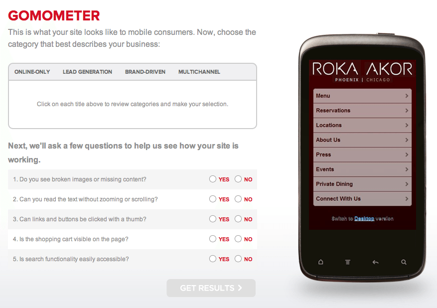
Google recently released a tool that allows you to see how your site looks on a smartphone. The tool also provides a set of questions that are used to calculate your site’s mobile score on a scale of 0-4.

Does this simple tool tell you everything you need to know about mobile optimization? Of course not. But it’s an easy way for restaurants to get a benchmark on where their mobile site performance stands.
What does a mobile optimized restaurant site look like?
- Fast – If your site takes more than a handful of seconds to load, most mobile users will give up and move on.
- Simple – There should be a clear navigation path, with everything most users need on the landing page.
- Finger-friendly – If a finger or thumb can’t push your “menu” button, things just aren’t going to work out.
- Platform-friendly – You want a site that works for all the major operating systems – iOS, RIM, Android and Windows.
- Maps – if someone nearby is searching your site on a mobile device, chances are they are going to want to know how to find you. Your landing page should provide links to address, maps and directions.
- Use mobile site redirect – If a mobile device accesses your site, make sure you have code in place to deliver the right experience.
- Go for the conversion – A mobile site should make every effort to painlessly collect user data such as email address and phone number as well as offering a clear path to make online reservations.
Have questions about how to begin the mobile optimization process for your restaurant or bar? Share them in the comment section below or drop us a line.