

The launch page is a great way to build excitement about a product or service as you roll out your go-to-market strategy. There are countless launch page examples ranging from stealth mode to gamified, but at the end of the day the key is to give users just enough information to make them care. As Smashing Magazine recommends, a viral launch page should do three things:
- Let visitors know what you’re doing
- Spark some interest
- Make use of that interest by giving them a chance to subscribe to your updates
One launch page example that came across our desks recently was that of Oyster, or if you prefer startup similes, “Netflix for e-books.” Being one of only a handful of services of its kind, Oyster has gotten its fair share of press in the past several weeks. Interested parties are sent to the page below.
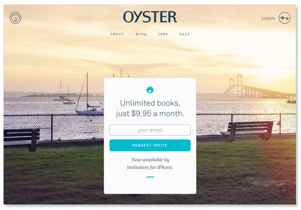
Although there’s a login option for existing users in the upper righthand corner, the main focus of the page is to explain the Oyster concept; in this case a one-liner does the trick. Visitors can sign up to request an exclusive invite from the box in the center — because there’s nothing like a walled garden to build excitement for a product or service. It’s cool, but you can’t have it yet!
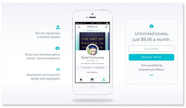
If visitors require more information before giving up their precious contact info, they can scroll down for an animated tutorial of the app and a quick, bulleted list of the apps main benefits. The form field conveniently follows visitors down to this screen so they can sign up at any point.
What are the best examples of launch pages that you’ve seen lately? Share links to your favorites below.