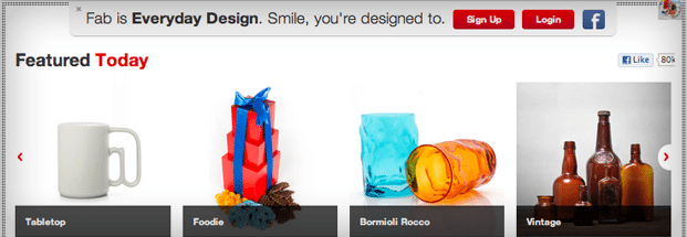
At 7 million users strong, design-focused e-commerce site Fab.com knows a thing or two about user experience. But no one’s perfect – in fact, Fab.com fielded quite a few complaints for requiring visitors to log in to view the products on their site. Founder and CEO Jason Goldberg describes the issue in a recent blog post:
“As we get 50% of our signups from social sharing, having this signup requirement to view products was really frustrating to users and shooting us in the foot. There’s not much worse than getting excited about a product your friend shared on Facebook or Pinterest or Twitter, then clicking through to view and buy the product and getting a huge login blocker. Lame.”
I experienced this Fab.com frustration multiple times, via both social media and email. Like most customers, I bailed when I saw a login screen rather than the product I was promised. Gating their content became a self-destructive policy, burning the bridges they worked so hard to build as one of the most socially savvy companies in e-commerce. So Goldberg and team decided to make a powerful UX pivot.
“Great user experiences get out of the way and help people get sh*t done.
“For 15 months now, visitors to the Fab.com website have had to login in order to view the products on our website. This helped us gain 7 million registered members, but it was not a great user experience. Great user experiences get out of the way and help people get shit done. Our mobile experience has not required login — that was the right way to do it.”
With the changes, an account is only needed if you want to add a product to your favorites or buy something. A closed e-commerce site has its benefits, especially when it comes to building membership. But as Goldberg shares, when those benefits begin to get in the way of customer experience, it’s time to reevaluate.