Whether it’s on purpose or a happy accident, when a consumer lands on your page, you’ve got a limited amount of time to reel them in. A well-structured landing page is key in getting users to take that next step – whether that means signing up for your email list, “liking” your Facebook page or proceeding to your main website. Each week, lonelybrand highlights a killer landing page design that gets the job done.
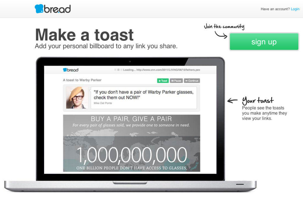
You already know that bre.ad rules. But we’d like to make a toast to bre.ad’s landing page, and here’s why it made our list of Best Landing Page Designs:
- A nice, crisp image of a MacBook Pro is just pleasant to look at. So pleasant, in fact, that we can see ourselves typing away in front of that very screen.
- Everything important is before the fold. There’s more good stuff below, but you can see everything you really need without scrolling.
- bre.ad’s landing page is a personalized invite to you, the potential user, dropping lines like “your toast” and inviting you to “join the community.”
Want landing page optimization tips? Look no further than our ‘Landing Pages 101’ white paper.
