An essential part of any digital marketing strategy is good old online ads. As Internet users we may have a love-hate relationship with them, but there’s no denying that ads can can really drive traffic to a site. Of course, that efficacy depends on the design of the ad in the first place. There are four essential elements that every effective online ad has. If you want your ads to garner clicks from interested potential customers, make sure they have these elements.
Draw them in with an offer
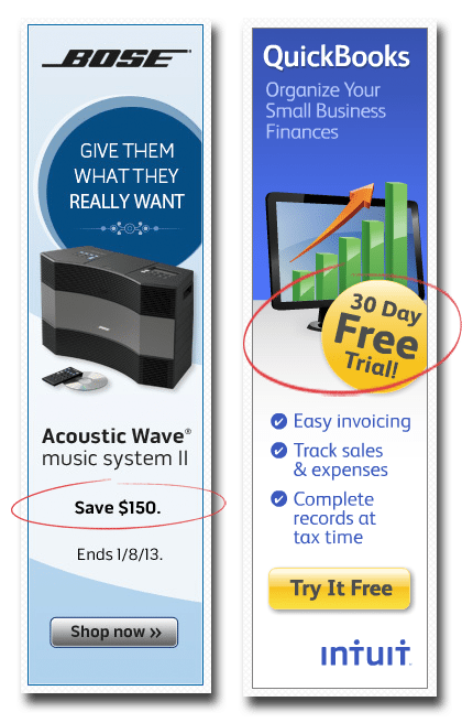
This may seem like an obvious element, but it’s also one that can be easily forgotten. If you’re offering a discount, a special promotion or even free shipping, spell it out clearly. Have it be a point of focus to help draw in interested customers and get you that much-desired click. The ads below for Bose and QuickBooks spell out their promotions clearly and highlight them so that they are set apart from the rest of the text.

Use attractive imagery/color scheme
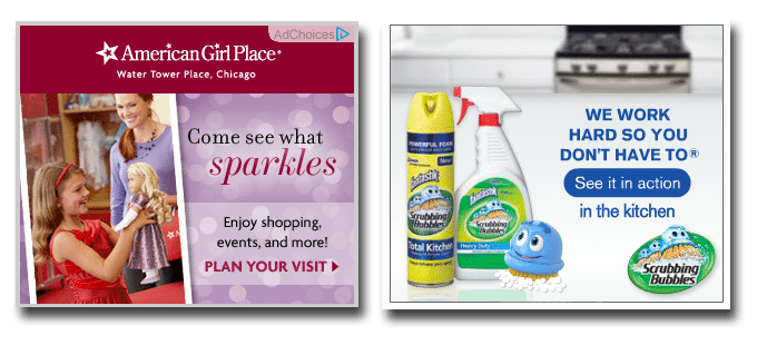
What counts as “attractive imagery” varies from brand to brand, but making sure your ad’s colors aren’t garish or hard on the eyes is essential. Yes, bright colors and large text can get your ad noticed, but if the brightness of the colors or the size of the text makes it difficult for you to focus on it for too long, rethink it. After all, you want viewers to linger on and click your ad, rather that hurry to scroll past it. Attractive imagery can also include using characters or products that customers recognize and have a positive association with. The ads below for American Girl dolls and Scrubbing Bubbles have good color schemes and positive imagery (look at those friendly faces), making them easy on the eyes.
Don’t forget about branding
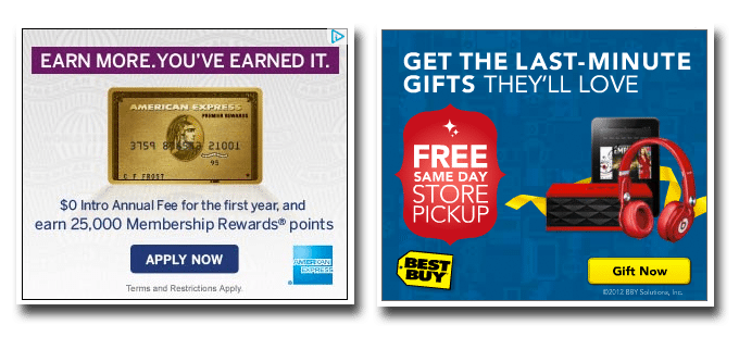
Sure, a mysterious ad can be intriguing, but how often do you click on an ad that isn’t associated with a brand you recognize? Even if your brand isn’t well known yet, use this as an opportunity to build brand recognition and association with potential customers. The ads for American Express and Best Buy achieve that. Yes, the brand names are prominent, but it goes beyond that. The AmEx ad features the brand logo, the brand’s card and even has a subtle AmEx themed watermark. Best Buy also goes beyond just including the logo by extending the color scheme of the ad to match that of the brand’s colors.

Don’t forget that call to action
It’s not enough to tell a viewer about your great sale or your trial offer period — you have to get them to act. Give them the incentive to click your ad by inviting them to check out the rest of the items on sale, or to demo your product now. It’s can be as direct as Ford’s “Click on a vehicle for a special offer” or it can be as short and simple as Weight Watchers’ “Learn more,” just make sure you include it!

There are a lot of similarities between creating a great online ad and a great Facebook ad. Check them out here, or learn more about improving your pay per click strategy.