If you don’t own a car, Zipcar is a great option for grocery runs, trips outside the city and those days when public transit just won’t do. Google “carsharing” or “Zipcar” and a search ad will point you to the landing page experience below, which focuses on three goals: segmentation, education and finally, lead collection.
Segment users by need
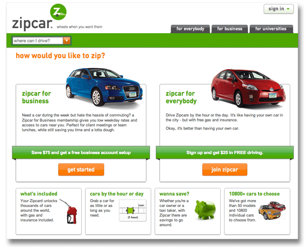
The first page asks, “how would you like to zip?” – the goal here being to divide visitors according to their Zipcar needs. Users can click on either Zipcar for Business or Zipcar for Everybody. Those that require more information can refer to the four boxes below, which offer details on pricing, availability and car choice.

Are visitors in the right place?
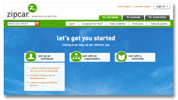
The next page further segments users, asking whether they would like to join as an individual, organization or university. And just in case anyone has gone through this process before, Zipcar offers to point them toward a time-saving sign-in process. Again, if users need more information, the tabs at the top answers common questions: “Is Zipcar for me?” and “How it works.”

Ease users through lead collection
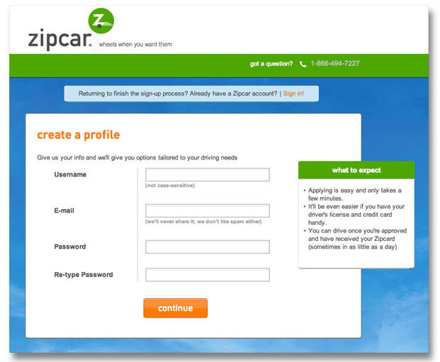
As you might expect, Zipcar needs a pretty hefty amount of information from users in order to lend them a car. To ease any tension about the process, a “what to expect” graphic lets users know that the process will take a couple of minutes, that they should have their driver’s license and credit card handy, and that there is indeed a light at the end of the lead collection tunnel. Setting expectations makes users less likely to abandon a longer form.

Not sure how what your landing page should include as far as education and lead collection? Our landing page guide provides the tools you need to determine the right balance for your product or service.