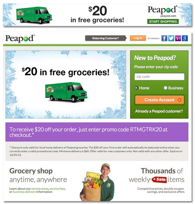
Coupons are one of the oldest tricks in the book, but a paid media execution of the old discount requires a good amount of attention to detail. You’ve got to let the new guys know that they’re in the right place without overshadowing pre-existing customers, all while getting everyone through the process as quickly as possible. Here’s how Peapod pulls off the coupon promotion using online display ads.

Consistent color palette. When a user clicks an ad, she wants a bit of reassurance that she landed in the right place. By using the icicle and truck motif across the ad and the landing page, Peapod lets users know that they are entering the anticipated experience.
Direct pre-existing users. With an ad that says “$20 in free groceries,” there’s no guarantee that all clicks will be from new users. A bar across the top of the landing page tells these users exactly where to go to claim their discount.
One field to start process. The sooner you get users into the shopping process, the better. On the Peapod landing page, as soon as users fill in their zipcode, they’re invited to start filling their virtual grocery carts.
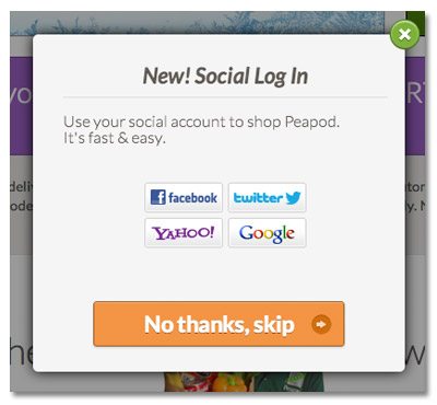
Social Log in option. Social log in minimizes password fatigue and streamlines the registration process. For anyone who wants to speed up the process, Peapod provides four options for social log in: Facebook, Twitter, Yahoo and Google.
For more tips on increasing landing page conversions, check out our free landing page design tool.

