Thanks to a few recent leadership shakeups, TV streaming service Hulu has been fodder for tweets and blog posts over the past several days. While we’re on the topic, let’s take a look at how the company fights for paid users in this highly competitive space with the help of paid media landing pages.

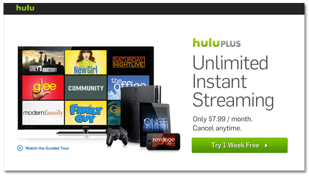
Demonstrate range of value. Since the stream of traffic to this page is fed by broad paid media search terms like “TV streaming” and “watch instantly” it’s important to show the wide spectrum of needs that the service can meet. Hulu relies on visuals to communicate a multitude of benefits for various buyer personas, including a range of TV shows and compatible devices.
Enticing button language. Asking people to sign up typically implies some sort of commitment, so instead Hulu invites visitors to “Try 1 Week Free.” And for true commitment-phobes, the “cancel anytime” bullet directly above this button lets users know that the free trial is in fact just a trial.
Quick intro video. Rather than including a block of heavy text, Hulu communicates with TV watchers via their preferred medium: video. The one-minute clip concisely explains how the service works and shows off both content clips and device compatibility.
For more tips on increasing landing page conversions, check out our free landing page design tool.