At a recent conference we learned from Google’s Avinash Kaushik that although consumers spend 23% of their time consuming mobile content, marketers only spend 1% of their budgets on mobile strategy. Clearly there is a disconnect here; marketing departments continue to throw money at platforms that people either don’t consume anymore (newspaper), or consume without the ads (television).
It’s statistics like this that put pressure on companies to jump into mobile marketing without really thinking. Yes, the media landscape is changing, but if you’re going to tag along, do so wholeheartedly. Statistics show that a less-than-perfect mobile campaign can get your brand into a bit of trouble; according to Google, 57% of consumers won’t recommend a business with a poorly designed mobile site, and 40% have turned to a direct competitor after a bad mobile experience.
To ensure that your mobile ad is helping rather than hurting, make sure the experience includes these five elements. If these UX elements are out of the question due to budget or time constraints, consider putting mobile on hold until seamless user experience is a realistic goal.
1. Maximize tiny banner ads with snappy text
Mobile banner ads are generally pretty tiny. Pack a punch in the limited space with something that sparks curiosity, like this invitation from Walgreens to print photos from your phone.

2. Send clicks to the right destination
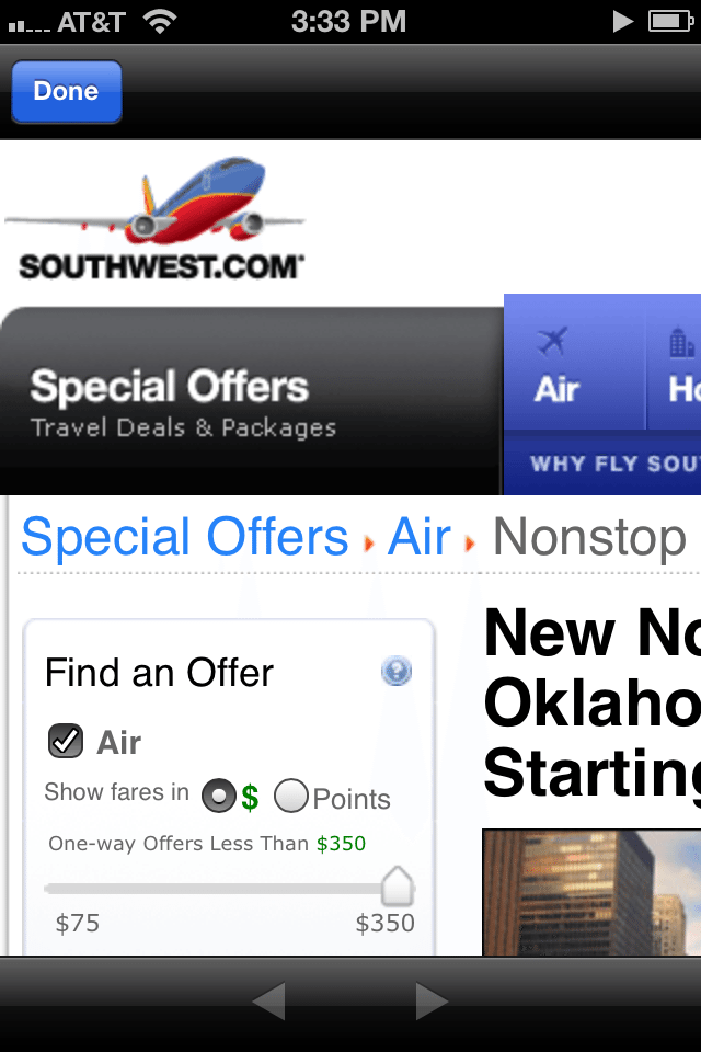
It’s fine to send users to your regular website, but we recommend sending them to a page that makes sense contextually. If you offer a special in the ad, don’t make users hunt for said deal on your homepage. And to avoid the pinch-and-zoom mess below, it’s equally important to send users to a webpage that is optimized for mobile.

3. Better yet, build a mobile landing page just for the ad
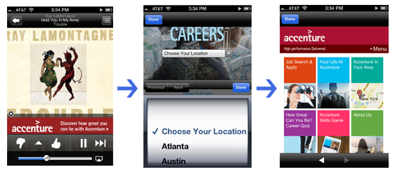
Tailoring a mobile experience just for the ad is really the gold standard – users will be able to navigate to exactly what they came for, and chances are, they’ll leave happy. This ad from Accenture does exactly that. With a click, users are prompted to select their location in an iPhone-friendly format and are then taken to a landing page that was clearly optimized for this platform. Visitors are presented with six relevant options of where to go next – and they all conveniently fit on one screen.

4. Tappable buttons
There’s nothing more frustrating for a smartphone user than a button that’s too small to tap or too close to other tappable options. Keep finger tapping in mind when building your mobile ad, and don’t make things harder than they have to be.
5. Geolocation
Smartphones are fully loaded with GPS technology, so why not take advantage of that feature and share nearby locations? Offering this information straightaway is much more pleasant than having visitors enter their zipcode to find stores.
Should your brand take the mobile ad route? It depends on your audience, your product and your budget. But don’t do mobile for the sake of doing mobile; instead, aim for a seamless user experience.