Currently in beta, Ideapod could very well represent the next step in social media. Described as Upworthy meets Pinterest, Ideapod highlights idea from thought leader, world leaders, and other influential figures in an effort to spark discussion and, hopefully, make the world a better place. More than a great concept, though, Ideapod has a great landing page. Here is a closer look at some of the essential elements.
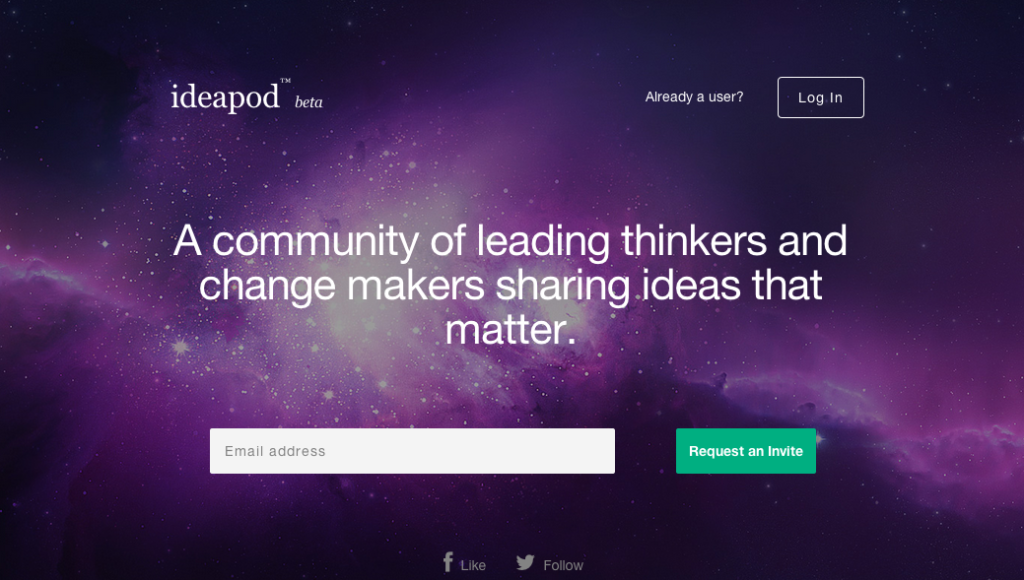
The first section of the landing page is colorful, with an interesting hero image and a compelling one-liner. It stands out in comparison to the sites we visit on a daily basis, and it also makes sure to put the call-to-action (“Request an Invite”) front and center.
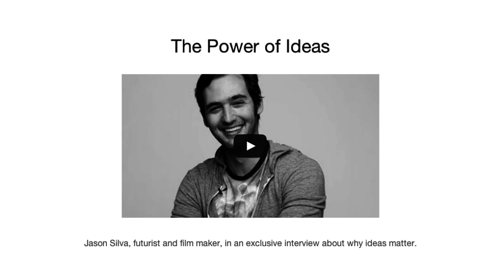
Scrolling down, the layout brightens up, helping visitors distinguish between sections. This second section offers visitors an introduction to the site’s founder in the form of a video, immediately giving them additional background on the site’s history and mission.
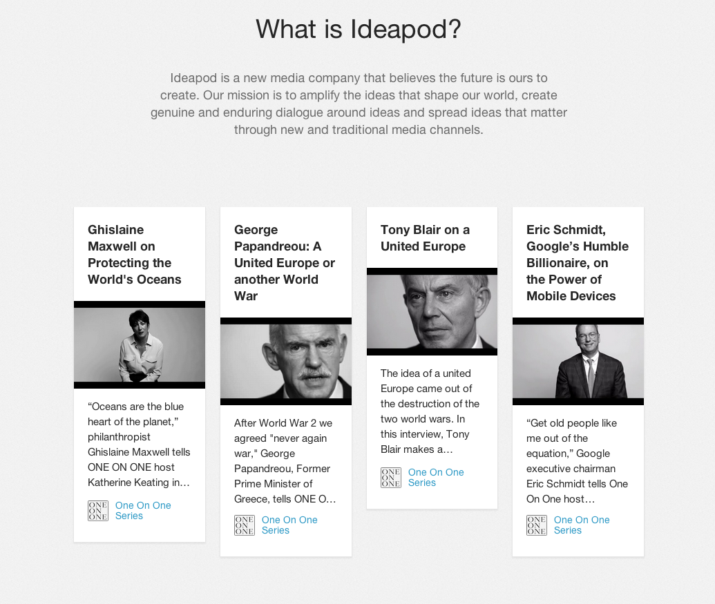
Finally and, perhaps, most importantly, another scroll reveals a mock-up of the site’s layout (a great way to entice users who haven’t yet requested a beta invitation), as well as a reiteration of its mission and examples of highlighted ideas from thought leaders.
Find more inspiration with some other great landing page designs here. Or, learn the elements of a great landing page with our white paper.


