Drinking and texting? Bad idea.
Buying wine with your smartphone? More popular than you might expect.
According to Cam Fortin, Mobile Website Project Manager at wine.com, 8% of the popular wine buying site’s web traffic comes from mobile phones. An additional 5-6% comes from tablets. That’s no small feat considering the average iPad order value is 50% higher than the site average.
Given this information, the folks at wine.com made a very logical conclusion: mobile users matter.
We had a chance to sit down with Cam and learn how the number one rated online wine store deployed a mobile strategy.
Note: I played around with the mobile site before our interview and ended up buying a few bottles of wine for my parents for Christmas (I hope you’re not reading this Mom and Dad).
With a pretty cool iPhone and iPad app on the market, why did you decide to dive in with a mobile site?
CF: It was all about the numbers, really. We saw a spike in non-iPhone traffic to our website, especially among Android users. Plus, it’s a pain to maintain an app. With a mobile site, we can focus on updating one thing for all platforms.
What are the most important features of a mobile website?
CF: We really just wanted to make it easy. We see a lot of return customers, so we wanted to make it easy for them to find and buy the wine they want. So we integrated options like preferred shipping and billing so that these customers can avoid the pain of entering the same info over and over agian. My record time for placing a return order is something like 15 seconds. So it’s fast.
Were there any other goals you sought to accomplish with this site?
CF: Our next step was to make it interesting to everybody. Right now we’re at the commerce level, but we want people to be able to use it as a database to learn about the wine they’re drinking, no matter where they are.
Why do you think your site is so popular among mobile users?
CF: A lot of it is search – people in restaurants pick up their phones when they are actually drinking wine and try to find out as much as they can about it. Wine is an interactive – you want to learn about it when you drink it.
Do you have a favorite bottle of wine?
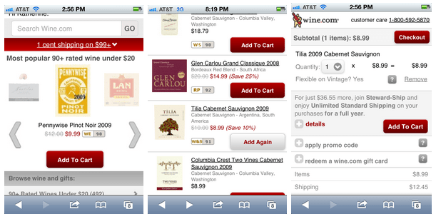
CF: I’d say Tilia. [Someone laughs in background.] My coworker is laughing at me because it’s one of our cheaper bottles. But I love it.
Nice! That’s the bottle I bought for my parents. Don’t tell them it’s cheap.
Wine.com: Lessons Learned from Mobile Deployment
- Applications aren’t always enough. Differences in platforms, laborious maintenance and the fact that some people just like to explore a retailer via the web all point to mobile web capabilities as a logical solution.
- Content is king. Not everyone who visits your site is going to buy something. But when users turn to wine.com to learn about the wine they are drinking elsewhere, that’s huge. Being the go-to resource is invaluable, and chances are next time they need a bottle of wine they’ll turn to the trusted experts.
- Mobile websites should revolve around two things: ease and speed. The mobile user wants to find what she needs quickly and easily. If it’s not simple, she’ll go elsewhere.
- Mobile customers are valuable customers. If you ignore them, they’ll ignore you. End of story.
