 Today is an exciting day at Techweek thanks to the eclectic mix of ideas at Startup City. The event provides an area for startups and aspiring entrepreneurs from Techweek LAUNCH to demo their products and network with potential investors and customers.
Here at lonelybrand we’re pumped to get a firsthand look at what the Startup City participants are up to, and before we head over to the Mart, we’re taking a look at the stellar landing pages behind these startups.
Tula Software
When Maile opened her own yoga studio in Logan Square, she went on the hunt for software to organize her business and website, but quickly found that none of tools on the market were as functional or easy to use as she had hoped. Conveniently enough, Maile’s husband Andrew runs a Chicago software company. So the two got to work building an ideal piece of software just for yoga studios. Tula Software includes an embedded calendar, easy class creation, flexible pass types, user permissions, and performance reports.
Tula’s landing page gets the point across quickly – with one glance, users know exactly what purpose the product serves. Plus, seeing founder Maile’s face right on the intro page builds an immediate personal connection between the user and the company. Visitors can either log in or start a free trial, and the simple layout minimizes distractions.

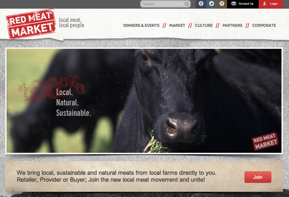
Red Meat Market
Red Meat Market is a socially driven online marketplace where users can easily buy locally raised meat. With the All-Natural Meat loving community, Red Meat Market is offering a way to easily source and order local, sustainable, all-natural beef, pork and lamb. Although the proteins come from many local providers, Red Meat Market is taking the work out of the search and providing them all in one place. As they say, “We offer consumers choice, control and convenience while we offer local providers the ability to sell meat products direct to consumers and wholesale customers with little or no effort.”
The graphic on Red Meat Market’s landing page tells users everything they need to know: “100% Local. Natural. Sustainable.” At the bottom of the page there is an option to join, but first users can learn more about the company, where to find them and exactly what they do. Links to social platforms like Pinterest give users a chance to connect with the brand on a more personal level.

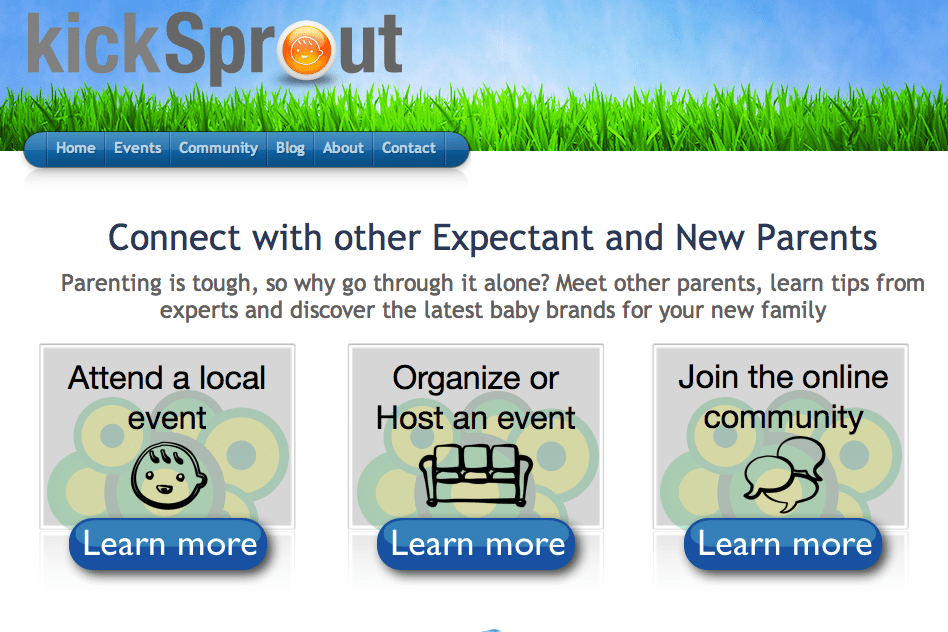
kickSprout
kickSprout connects expectant and new parents to build community and stronger families through local events. As parents themselves, co-founders Leasa and Carlo Navarro want to provide new parents with the support that books and blogs cannot – that sense of community that comes from having a support group nearby with parents juggling the same life changes and emotions that come with a new family. The kickSprout community helps users find and organize local events and join an active online community of new parents.
kickSprout is about community, and this is immediately apparent on the startup’s landing page, as they jump right in with a personal question for visitors. “Parenting is tough, so why go through it alone?” Users are then invited to check out one of three ways to join the community: attend events, host events or even join the online community.

For more on landing page designs, be sure to check out our ongoing series.