As of October 23, the reimagined stumbleupon.com is now out of Beta and available to all users. Since the social discovery engine released a Beta version in September 2012, over 100,000 users opted in. Much like eBay’s recent redesign, the new StumbleUpon turns to a clean, visual layout.
Homepage
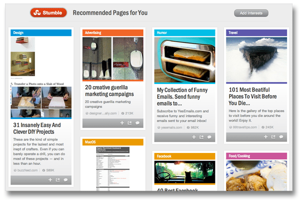
The new homepage features a selection of pages based on your interests. Stumbles are presented as boxed out images, much like you see in a Pinterest feed.

Social
StumbleUpon has always had a strong social component, but after December 2011’s redesign, there were complaints that it was hard to access friend activity through the menu. The Activity tab is now a main menu option, putting more emphasis on user interaction.
Lists
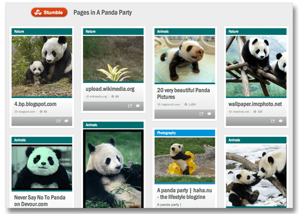
And for the most Pinterest-like update of all, StumbleUpon introduces Lists, which let users collect stumbles according to category. In the example below, the Panda Party List features a selection of panda-themed stumbles, all contained within one List (or Board, in Pinterest language).

User profiles
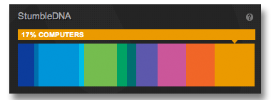
The updated user profile houses likes, lists, interests and another new component known as Stumble DNA, which is a visual representation of the pages you’ve liked. Below, my Stumble DNA gives a color-coded look at the pages I’m interested in.

Is Pinterest’s visual method of organization becoming the new face of the Internet? Is it wise for sites like eBay and StumbleUpon to follow suit? Share your thoughts below.