

When it’s been a while since a user has engaged with your brand, email is a logical and direct channel for reengagement But let’s not forget: the inbox is a sacred space. If you don’t provide a compelling message, subscribers will do one of three things: ignore you, unsubscribe or mark your content as spam.
Back in 2011 I signed up for a MyLowe’s account to do a bit of recon on their retail content marketing program for a blog post. Months and months went by without any activity on my end. Finally, as the 2013 home improvement season approaches (that’s a thing, right?) this well-executed reengagement email landed in my inbox. The campaign illustrates several examples of what a solid marketing email should include.
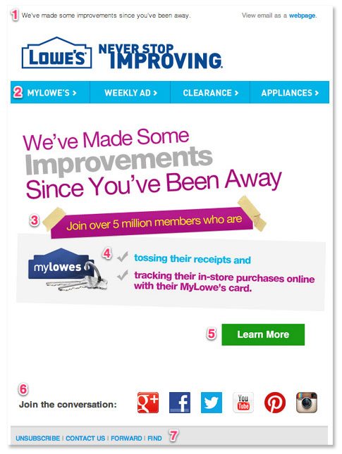 1. Optimized pre-header text
The pre-header text is an important but oft-neglected email marketing component. Lowe’s takes advantage of this space by plugging in a one sentence summary of what the email is about. Find out how you can optimize pre-header email messaging here.
2. Menu options
The horizontal menubar keeps things neat and tidy and offers a few additional options in case subscribers aren’t interested in the primary “Learn More” call to action below.
3. Social proof
By pointing out that 5 million members are participating in the platform, Lowe’s fosters that “everybody’s doing it” mentality. Social proof is a powerful thing.
4. Focus on benefits
Features are shiny and cool, but benefits drive action. Lowe’s uses two concise bullets to focus on how MyLowe’s makes life easier for 5 million members.
5. Primary call to action
The point of this email is to get subscribers to log back in and use their MyLowe’s account. That big green Learn More button is hard to miss, and takes clickers straight to the login page to get started where they left off. Since this email is specifically targeted to existing users, it makes sense to send them here rather than to a generic sign up page.
6. Smart social options
Have you ever shared an email via social media? Me neither. Instead of asking subscribers to do something nonsensical like that, Lowe’s simply gives them a place to “join the conversation.” Logos are sized prominently enough to grab attention, but don’t take over the primary call to action. Six social options seems like a lot — but it works because each and every one of these platforms is well-tended and worth visiting (especially YouTube — check it out). If your Pinterest boards aren’t great, there’s no reason (or excuse) to share them via email.
7. Unsubscribe options
The email unsubscribe button should be immediately visible to readers to avoid unnecessary spam reports. Lowe’s houses this and several other housekeeping items prominently in the footer.