Google paints a happy picture of its social user base, touting that “170 million users have upgraded to Google Plus,” or whatever that means. Google’s pet project may be behind in active users, but that doesn’t mean they’re letting things slip when it comes to user experience. A few months ago, we covered the above par mobile experience offered by Google Plus (take that, Facebook Mobile crashes). And as of April 11, there’s a brand new web interface waiting for you on GooglePlus, including new improved menu, profile, photo, hangout and explore options. Overall, the redesign is easier to use and has a more aesthetic appeal than its precursor . . . and certainly heavier on the white space.

1. Personalize your sidebar
The first thing you’re likely to notice when logging in to the new and improved Google Plus is the menu rearrangement. Instad of static icons on the top, you’ll now find menu options on the lefthand side. Drag and and drop icons to rearrange the order according to the features you use most, or even hide them from view by dropping in the More icon. Users can hover over certain icons to see more options – for example, when you place your cursor on top of Photos, you’ll see options to post images. This is Google’s attempt at making the social network a more personalized experience.
2. New profile pages
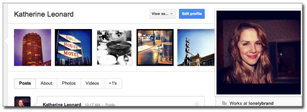
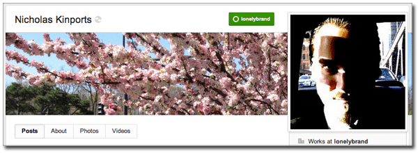
Another significant refresh element is the rearranged layout of profile pages, which moved the profile picture to the right and put more emphasis on users’ scrapbook images. Choose between 5 small square images, or one rectangular cover image that mirrors Facebook’s new timeline setup.
3. Share bigger photos
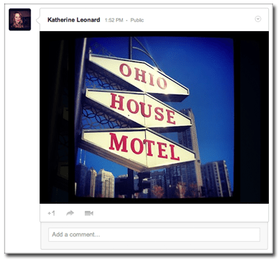
The Google Plus interface now features full bleed photos and videos, which plays to the growing popularity of visually-based social networks like Pinterest and Instagram.
4. Hangouts more prevalent
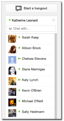
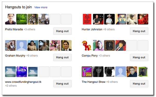
Hangouts are now easier to access thanks to a page (accessible through the main sidebar menu) dedicated strictly to public hangouts that are currently happening. You’ll also find a new and improved chat list that makes it easier to start hangouts with friends who are currently online.
5. Explore with the “what’s hot” feature
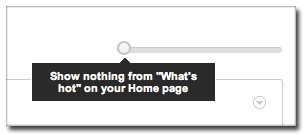 In the past few months you probably noticed Google Plus’ “What’s hot” updates sneaking into your feed. These trending updates are now housed under the Explore icon on the main menu. Visit this page to get a stream of the most popular content from around Google Plus, or if you’re not interested in strangers’ updates, adjust the amount of “What’s hot” stuff you’ll see on your Home page with the dial pictured to the left.
Google Plus may not have the active user base it hoped for at this point, but they are certainly making strides to become the increasingly mobile and visual social network that users seem to want.