Infographics have dramatically increased in popularity in recent years. So much so, in fact, that entire sites have been dedicated to them and sites likes Mashable highlight them in article titles. But creating them can be harder than it seems. If you want to create an attractive, effective, shareable infographic, keep these pointers in mind.
Find a fun, interesting theme that matches your message
An infographic’s illustrations are just as important as its data. If the illustrations don’t match the data, or at least the theme of the data, it will lead to confusion and frustration. Choose your theme carefully and then carry that theme throughout the infographic itself.
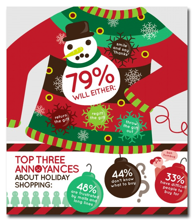
Great example: The Royal Bank of Canada recently conducted a poll that asked Canadians what they do with gifts they hate. They then created a fun ugly Christmas sweater themed graphic to share their data.
Dimensions, dimensions, dimensions
Not all screens are created equal, and that’s something to keep in mind when creating your infographic. It should be able to fit on a viewer’s screen with as little scrolling as possible. SubmitInfographics has a great rule of thumb, “If the infographic will be a vertical design, make it no wider than 1000px and try to constrain it’s length to under 10,000px if possible. If the infographic will be a horizontal design, make it no taller than 700px.”
Great example: Diet Chef created an infographic full of holiday dieting tips that, despite being large and easy to read, still falls within the guidelines at 800px wide and 3258 px long.
Choose bright, readable colors
Infographics with white backgrounds tend to be less effective than those with colorful backgrounds, and it’s easy to see why. An infographic with a white background tends to blend into the body of an article with colorful graphics stand out. Don’t be afraid to embrace colors, but be sure that they are easy on the eyes and are complementary. Colors that clash tend to be hard to read and colors that are too similar may blend together.
Great example: ISHN created an infographic detailing common OSHA violations. Each section’s background is a different color, making it easier to understand, and the colors of the fonts and backgrounds go well together, making it easy to read.
Cite your sources
If you are using stats to back up your assertions, then be sure to properly cite them within the infographic itself. This ensures that anyone who sees it, no matter how many times it’s shared, will know where to look if they want more information on a particular stat.
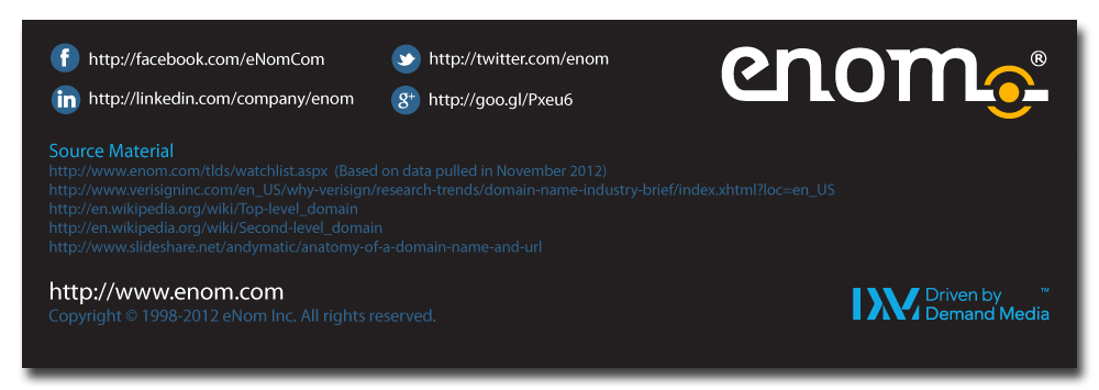
Great example: Enom created an infographic addressing the new generation of domain names. Because the infographic contains a lof of specific numbers and percentages, Enom elected to include their sources in the form of URLs at the bottom of the infographic (along with their own social info).
Looking for more content marketing tips? Check out our articles and guides to bring your content marketing strategy to the next level.


