Like many busy humans, my policy is generally to avoid an influx of random inbox deliverables at all costs. But thanks to a few minute details, these four invitations were just too good to pass up. Here’s how campaigns from Funny or Die, Dabble, Mashable and Blogshop used a few simple lines of text like fun newsletter names to convert users (me) from uninterested to enthusiastic subscribers.
Funny or Die
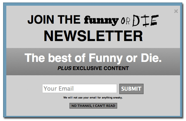
I didn’t really find it necessary to sign up for the Funny or Die newsletter – it just seemed like another impossibly irresistible distraction for my inbox. So I moved my mouse to the “No Thanks” button. But that button says, “NO THANKS, I CAN’T READ,” which led to an enthusiastic chuckle and immediate change of heart about signing up. On a more serious note, they also promise exclusive content and not to use your email address for “anything sneaky.”
Dabble
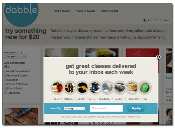
Upon heading to Dabble’s site, you’ll see a grid of awesome-sounding classes – “How to Get Your Dream Job,” “Let’s Make Whoopie (Pies)” and “Beer Brewing,” for example. But before your brain can compute the actual awesomeness of acquiring these eclectic skills, a lightbox pops up inviting you to “get great classes delivered to your inbox each week.” Curiosity got the best of me and I plugged in my email address without the slightest hesitation. Plus, mention of email frequency is always nice – I appreciate the reassurance that my inbox will be greeted on a mere weekly basis.
Mashable
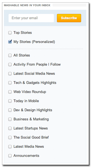
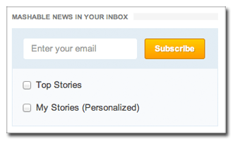
The publication subscription is a whole different monster. I like that Mashable lets you check the personalized box, at which point the tiny subscribe prompt expands to list your choices. Selecting the topics that interest me makes this email much more appealing than the generic version. The only thing I’d like to see added is a frequency option, i.e. daily, weekly or monthly.
Blogshop
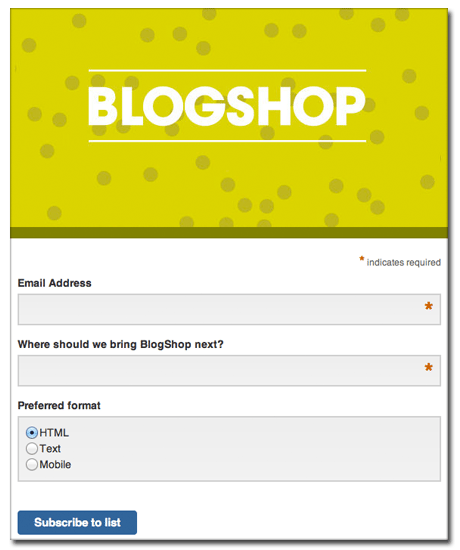
Blogshop wisely takes the user empowerment angle, asking on the prompt “Where should we bring BlogShop next?” No email signup means no opportunity to vote for your city, so those who are interested are bound to take that next step. I certainly was not about to miss the chance to put my two cents in.
Have any subscription signup prompts caught your eye as of late? Share a screenshot of your favorite lightbox with us over on Twitter.
